Wyspa Słodowa for years it has been a centre of various events organized, independently, with help of local visual artists and musicians. Concordia Design building, conjured by the brilliant minds of MVRDV only feshes out that uniqueness. To arrange one of the most demanding parts of the building – void (the undercut), the Investor asked for help none other than mode:lina™ designers. Our prime goal was to keep the idea of architecture’s complete immersion, while at the same time leaving enough space for comfy, intimate spaces for various meetings, informal gatherings and work.
A big void (undercut) is a space, widely open in every direction, where both interior and fora outside fow within each other. Grand mural created by Alicja Biała is the perfect testament to that openness and a compliment to Michelangelo’s Sistine Chapel. Efortless forms created bymode:lina™ paved the way for balanced interiors that perfectly supplement the scale of existing architecture. Hidden in smaller arrangements of each and every zone are all possible scenarios that guests are welcome to play out.
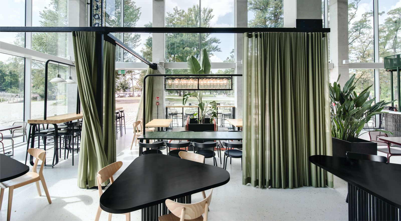
In the new space of the restaurant all elements: lights, textures, colors and shapes skilfully interact with one another. Open space of the building’s big restaurant was divided into smaller cubicles using tall plants and individually designed furniture. “Void” was flled with high legged tables with an integrated lightning system, smaller tables with specifc construction and freely fowing curtains from the metal hangers, all making space more intimate and cosy.
What’s even more important is that it’s easily moveable, allowing for reorganising space in the spirit of any scheduled event. Central space is occupied by a vast bar in the form of an easily accessible island. It is of great importance especially during summers, as the facade encompasses a set of wide doors that are fully opened during that season. Steel construction of the bar not only allows for keeping and presenting a wide variety of liquor, but also invites all-surrounding nature inside.
Back wall is closed of by the big dining section, which under the brand of SLODOWA presents guests with a broad selection that absolutely every “foodie” will adore. It’s central part is mainly composed of black tiles, which in turn is supported by perforated plate in the back and the wall that are a smooth continuation of the mural. Achieved color mapping clearly organizes space for three independent gastronomical concepts, each having its’ assigned color alluding to the mural above them.
Open terrace on the top foor of the Concordia Design is the great extension of the gastronomic concept down below. It’s focal points – enormous bar, in shape mirroring the one in the Void and big seatings imitating stadium-like tribunes, made from plywood with overprinted bits of Alicia Biała’s mural. Designers loosely referenced seaside resorts both material wise for the bar and in catalogue’s furniture character. Source by mode:lina™.
- Location: Wroclaw, Poland
- Architect: mode:lina™
- Design Team: Paweł Garus, Jerzy Woźniak, Kinga Kin, Anna Kazecka-Włodarczyk, Joanna Lenart
- Cooperation: Q2 Studio
- Area: Restaurant – 250 m2, Terrace 600 m2
- Completion: August 2020
- Photographs: Patryk Lewiński, Courtesy of mode:lina™

Photo © Patryk Lewiński 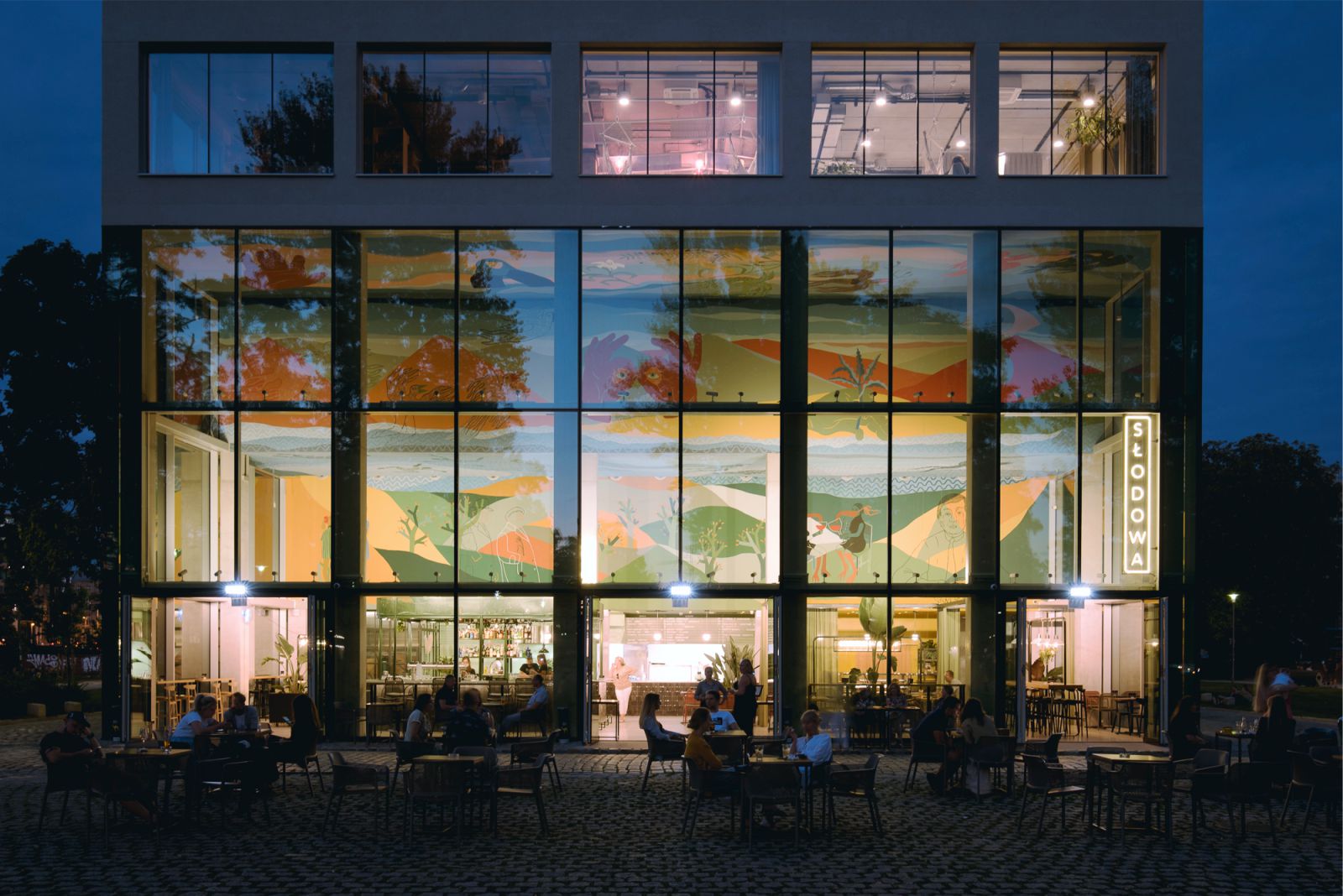
Photo © Patryk Lewiński 
Photo © Patryk Lewiński 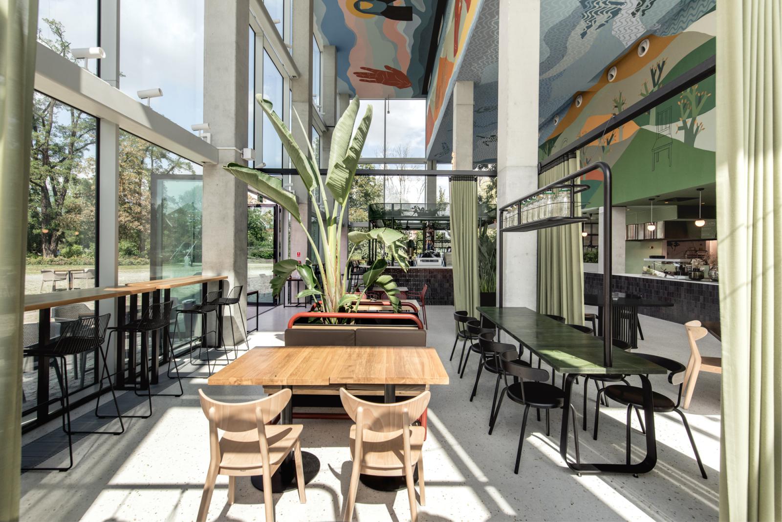
Photo © Patryk Lewiński 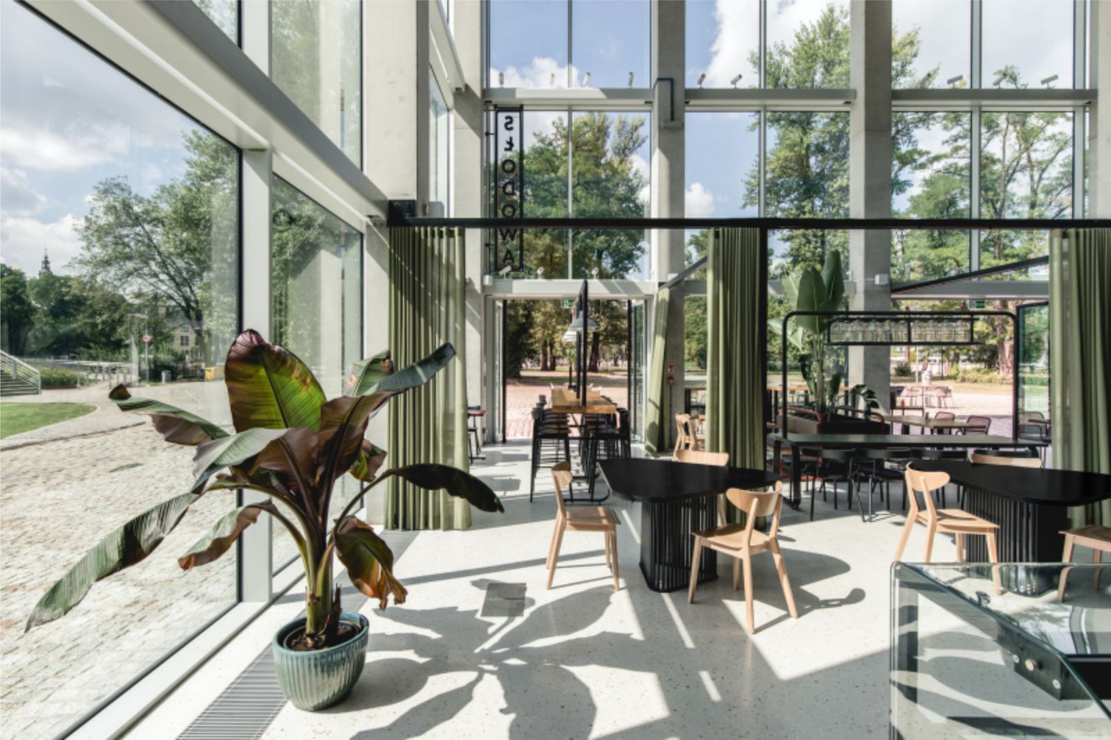
Photo © Patryk Lewiński 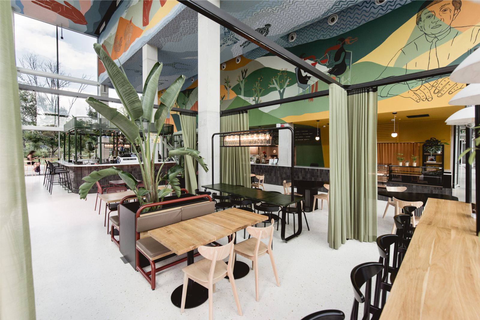
Photo © Patryk Lewiński 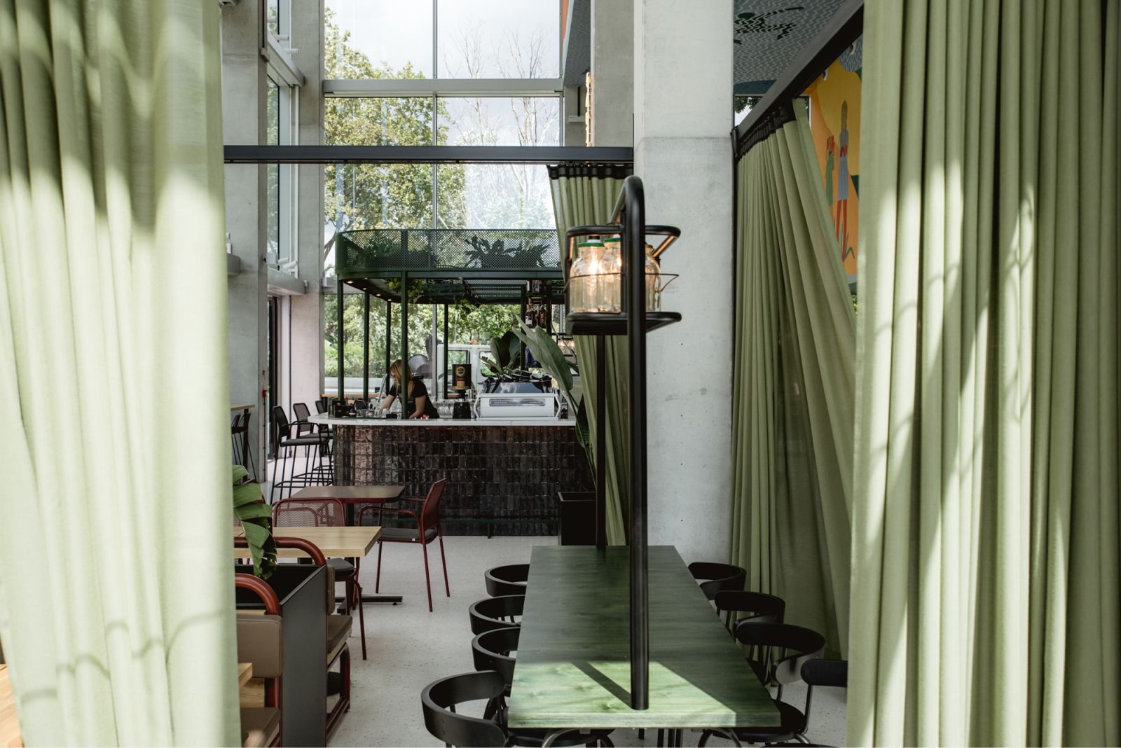
Photo © Patryk Lewiński 
Photo © Patryk Lewiński 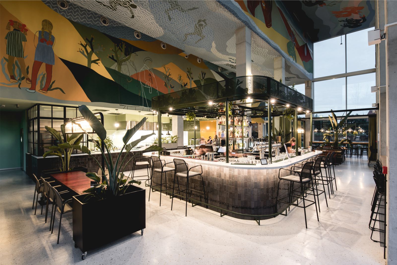
Photo © Patryk Lewiński 
Photo © Patryk Lewiński 
Photo © Patryk Lewiński 
Photo © Patryk Lewiński 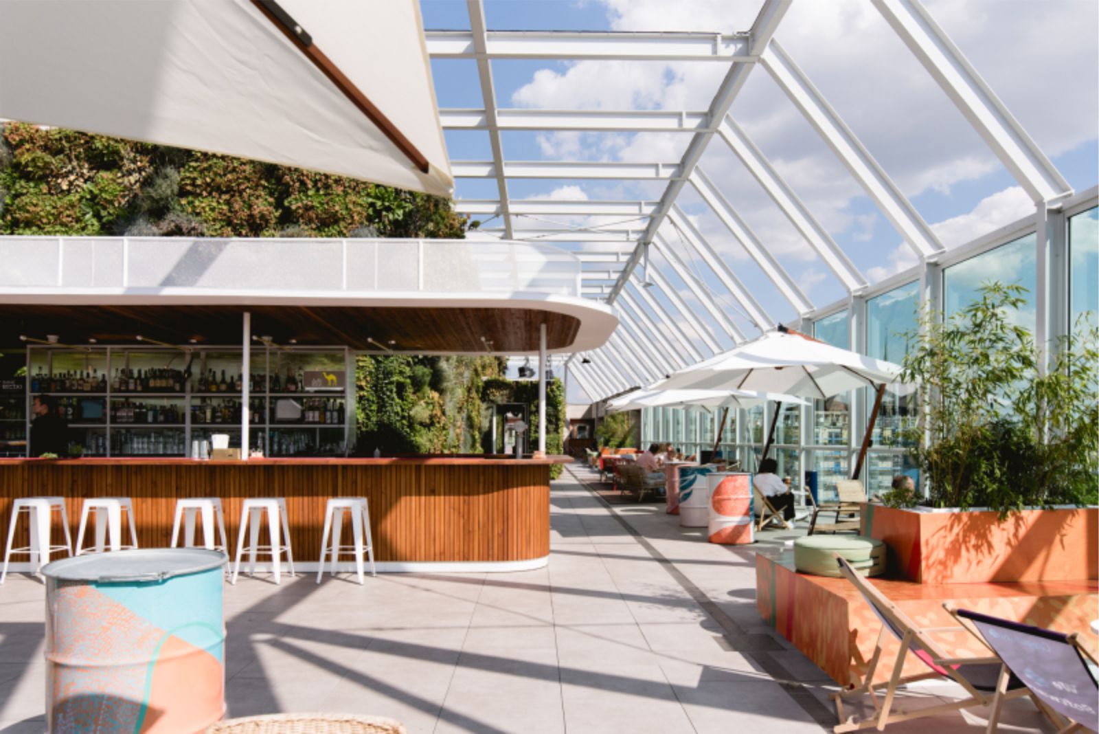
Photo © Patryk Lewiński 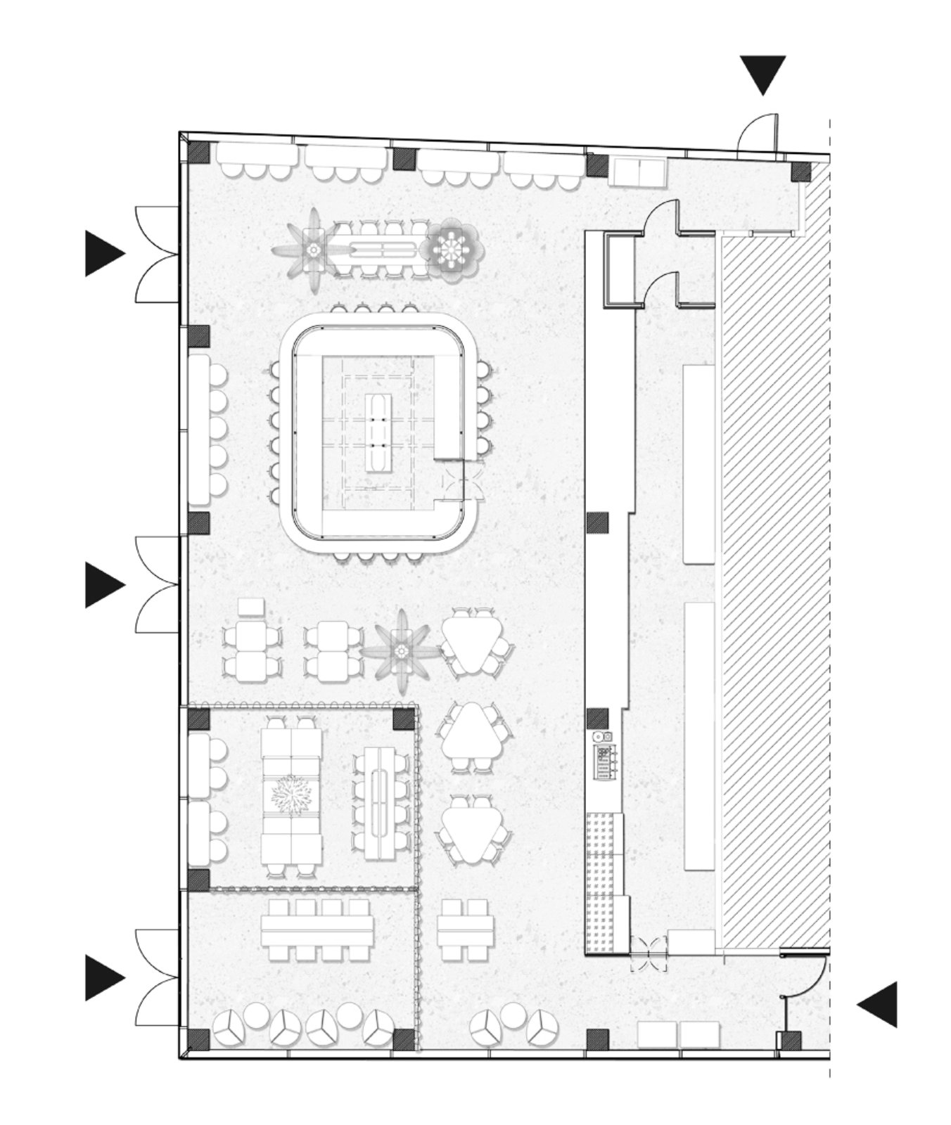
Ground Floor Plan 
Scheme

That is really fascinating, You are a very skilled blogger. I have joined your rss feed and stay up for in search of more of your magnificent post. Additionally, Ive shared your web site in my social networks!