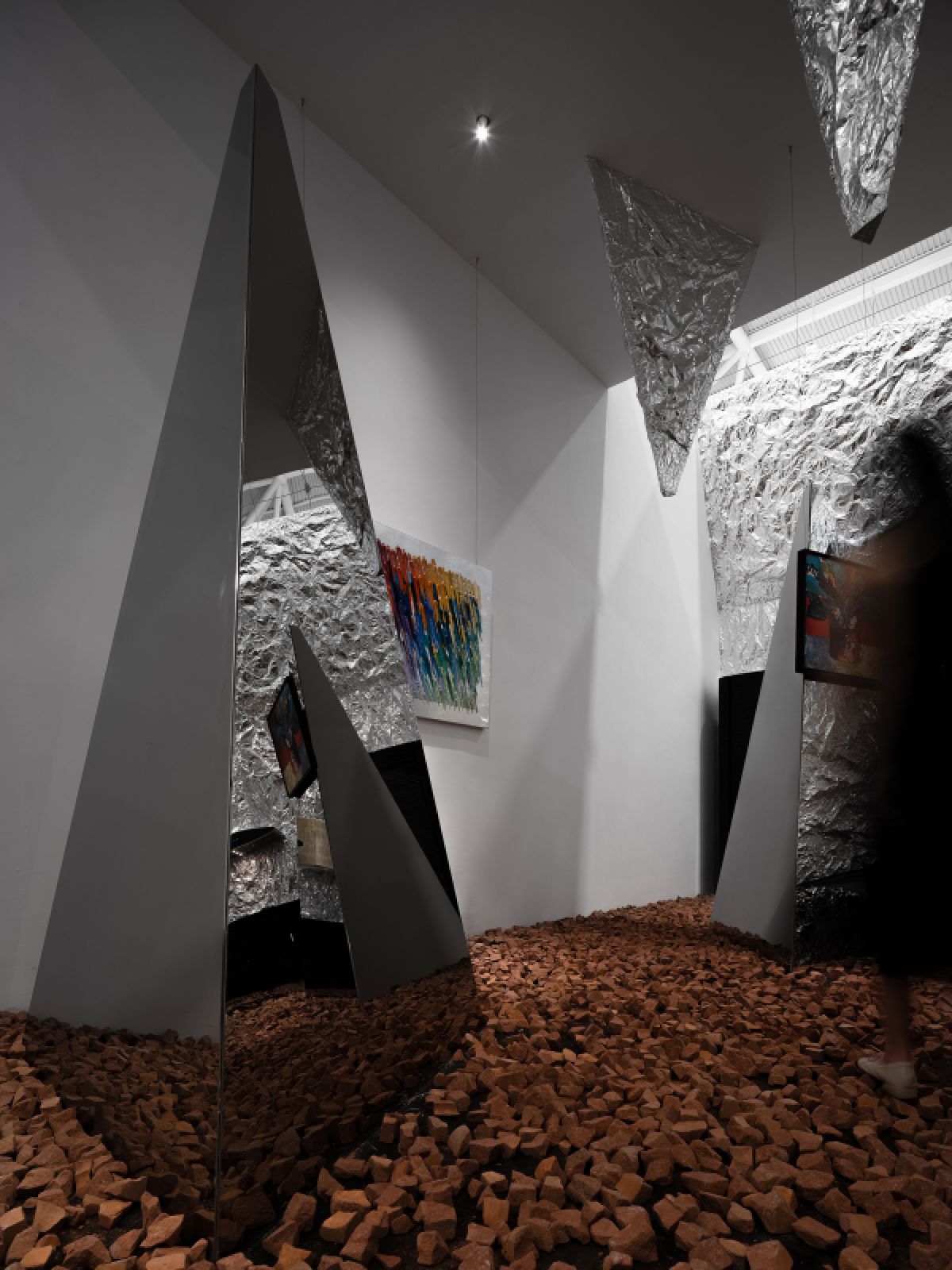
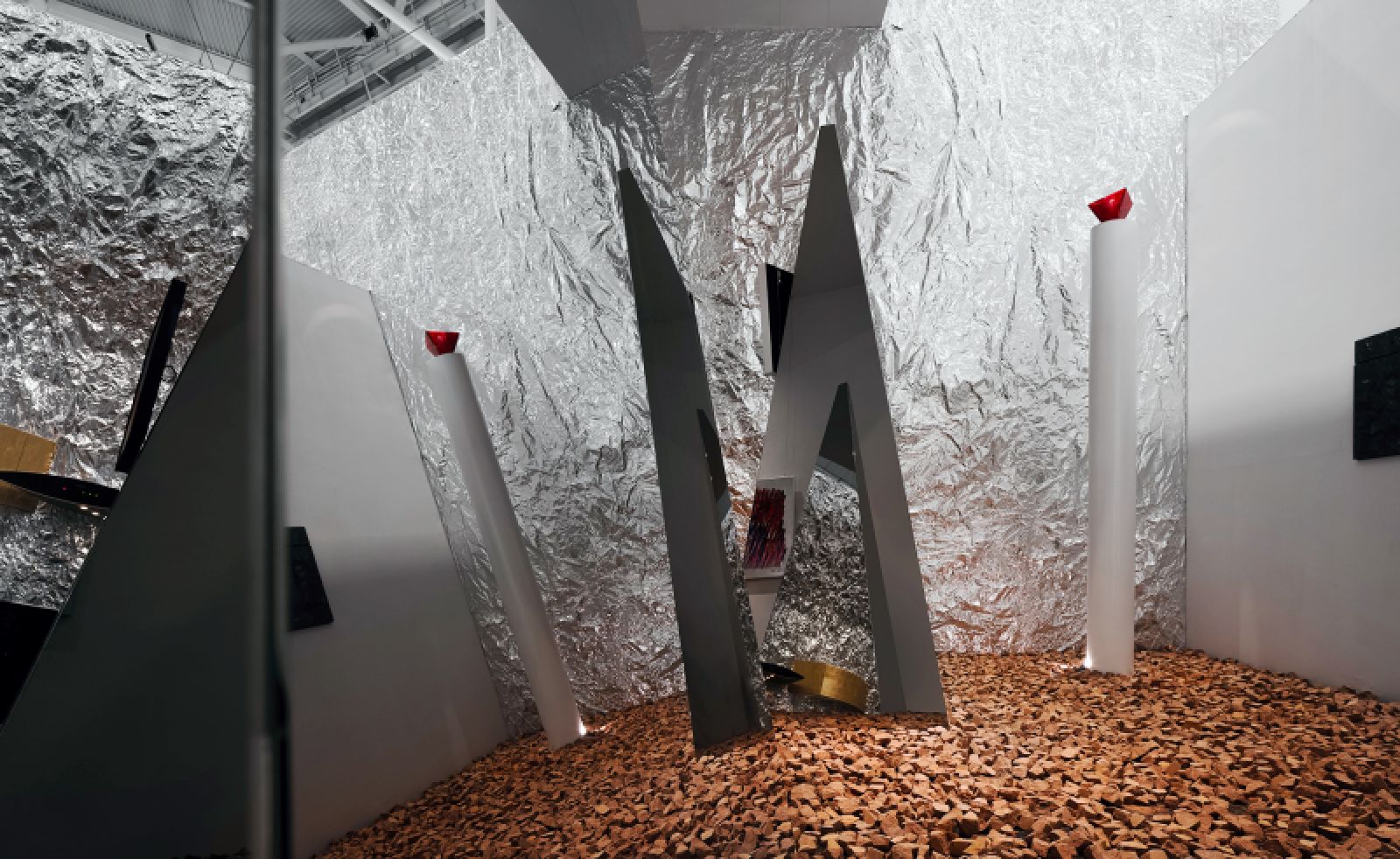
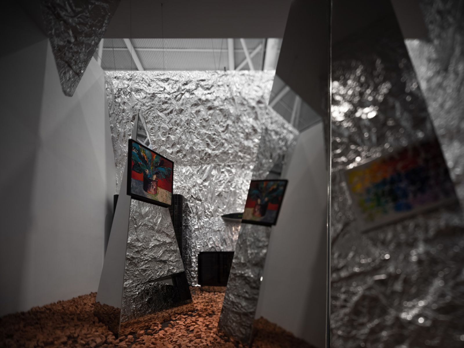
The project is a temporary exhibition space for displaying paintings and kitchen products — two things that are unlikely to be exhibited in one space. By focusing on how to perfectly integrate the two in a 60㎡ space and evoke dialogue with visitors, we created an “art gallery” that integrated impressive, diversified experiences.
Free segmentation
Considering the dense crowd of visitors, we utilized triangular structures to segment the space, to create a free yet directive setting. The goal was to guide the smooth flow of visitors and create a free visiting route with a rich sense of rhythm.
Unexpected experiences
This exhibition space was situated in a large exhibition hall with lots of exhibition stands and various displayed products. It needed to strengthen its identity at the larger space and to impress, surprise visitors. We brought red stone pieces to the floor, which sent a signal of danger and surprises to draw visitors’ attention.
The metal walls featured wrinkled textures, creating a strong visual impact. The glass was customized, which enriched the layering of the space and evoked visitors’ curiosity to explore the space and exhibits. All of those elements were intended to bring unexpected surprises, so as to efficiently help the brands to attract and impress visitors.
Unknown & game
As visitors moved in the space, the triangular mirrored glass showed varying images by reflection. It reflected individuals, others, objects, changing scenes and what were going on in the space. The mirror images had nothing to do with form, function or aesthetics, and everyone might have different understandings. There was no definite answer. It was a five-day game, and we were just experiencers and observers.
Behaviors & feelings
Strolling in the space, visitors could feel the changing relationship between the real and virtual. This is a temporary space, but for us what matters is the process. Source by AD Architecture.

Photo © Ouyang Yun 
Photo © Ouyang Yun
- Location: Shenzhen World Exhibition & Convention Center, China
- Architect: AD Architecture
- Chief designer: Xie Peihe
- Client: Shenzhen Institute of Interior Design (SIID) / THE 3RD SPACE
- Area: 60 square meters
- Main materials: mirror, tinfoil, lighting fixtures (SIKI)
- Exhibited brands: Brave Art Group, Miele, Aster
- Completion time: March 2021
- Photographs: Ouyang Yun, Courtesy of AD Architecture


