Located in Foshan, China, the project is a showroom of OSSO, a brand that manufactures and supplies sintered stones. In recent years, sintered stone has been widely used as veneers in high-end customization field. Its big scale, natural texture and installation techniques were required to be presented in this showroom in a professional manner.
Foshan Topway Design conceived an aesthetic space through drawing on the aesthetic textures of OSSO’s products and using sophisticated techniques. The design team endowed the showroom with commercial functions, and meanwhile created distinctive artistic and aesthetic experiences. The key of the design was how to perfectly integrate the aesthetics of products, space and nature with art.
“Trajectory of Stars”
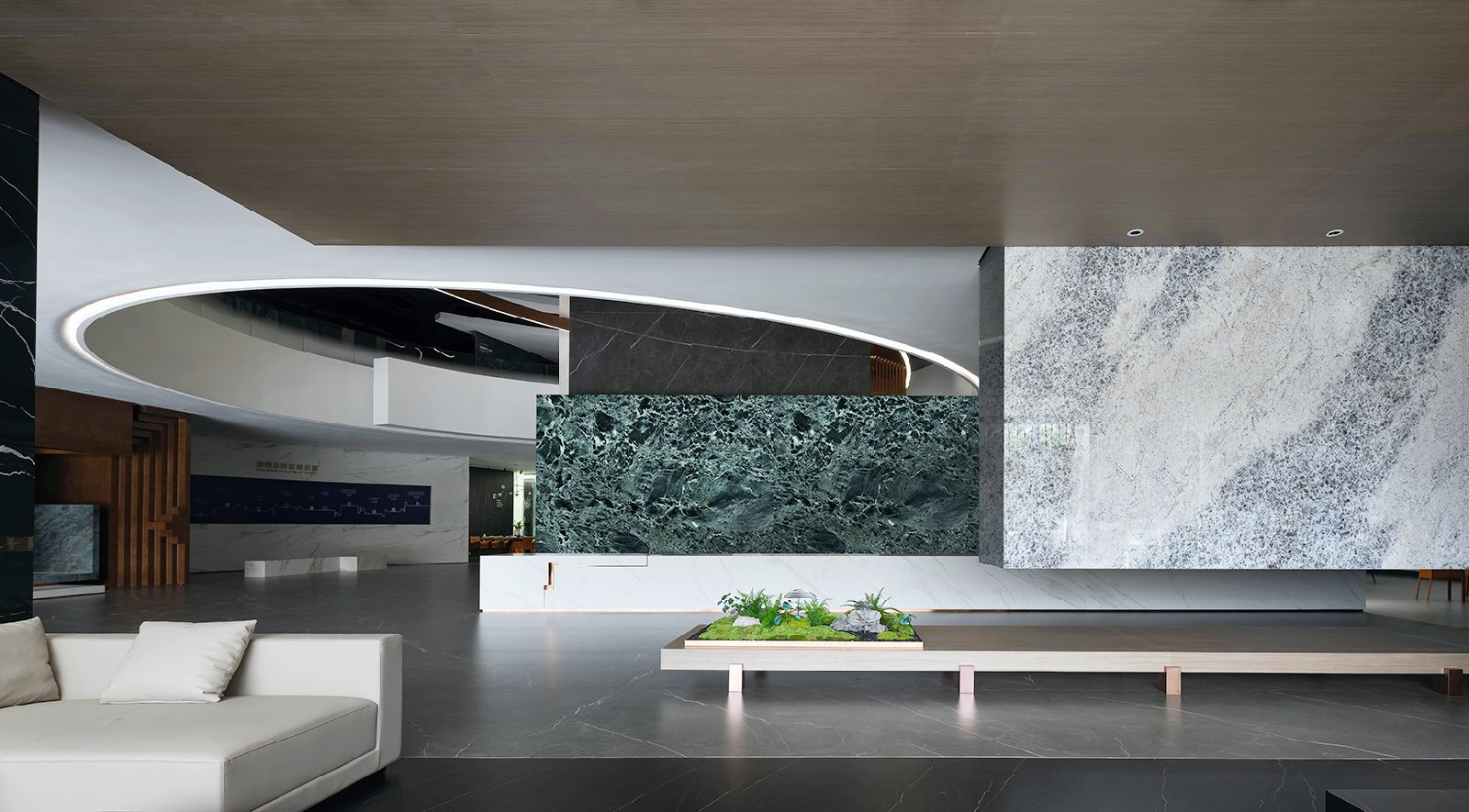
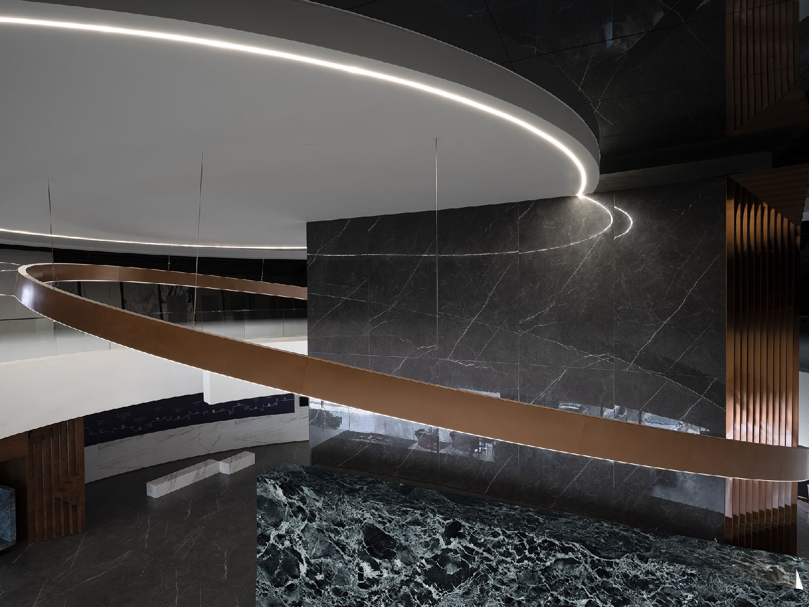
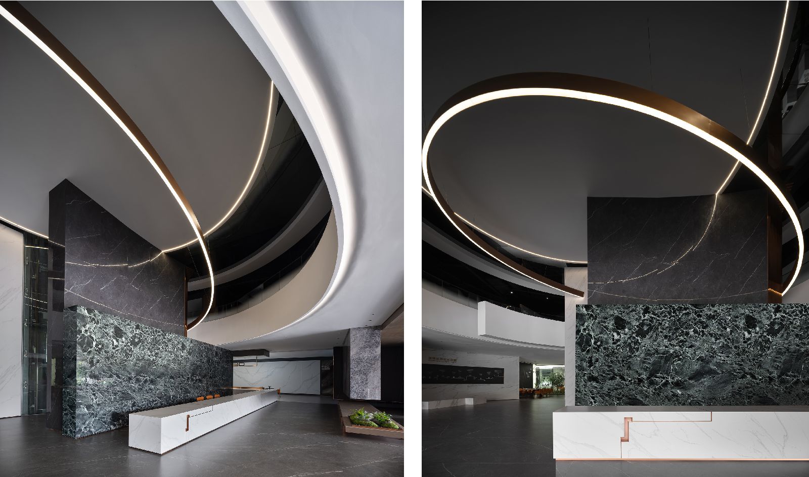
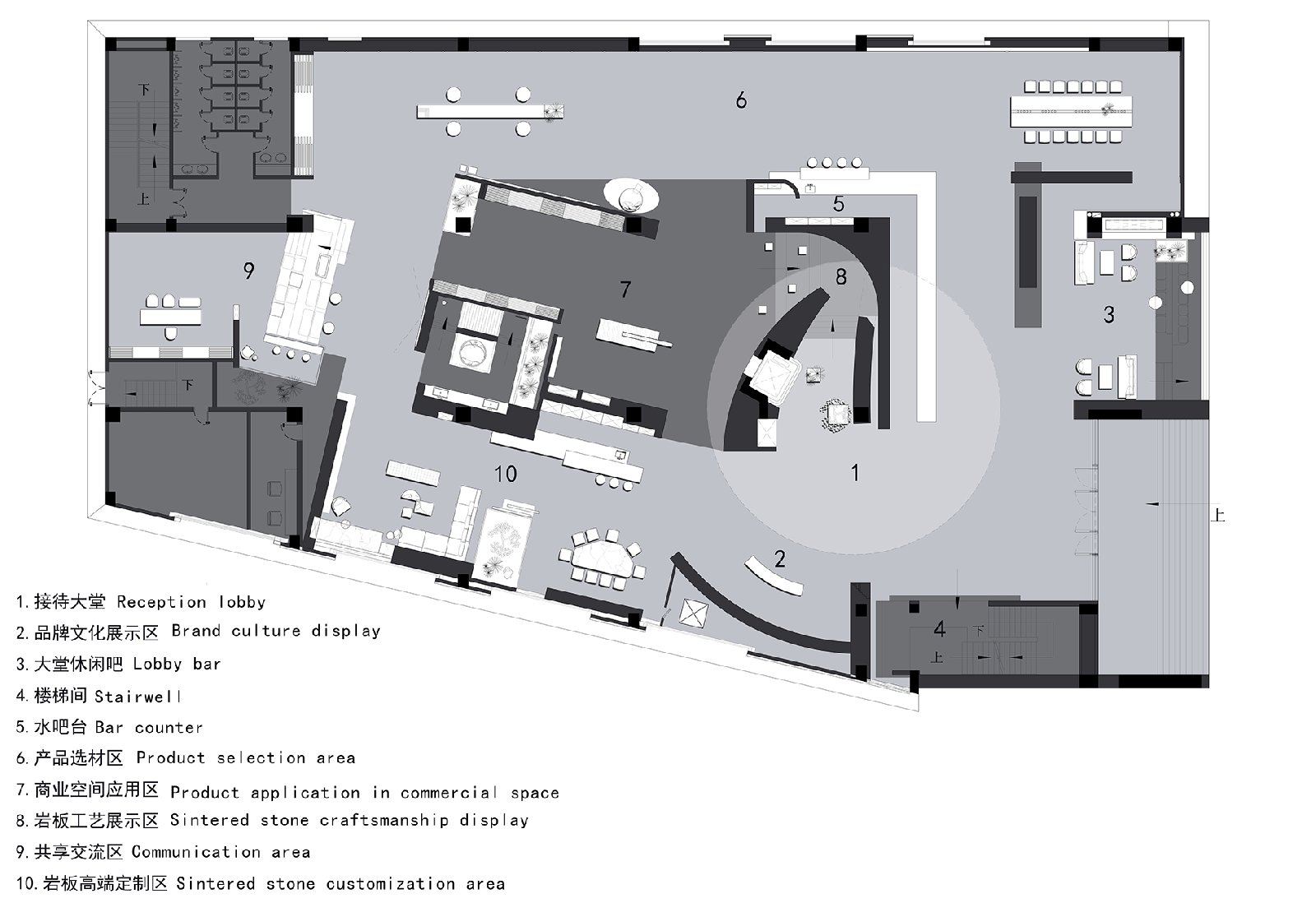
Through tactfully drawing the two “O”s from the brand name “OSSO” as basic visual symbols, the designers created a circular hollow space, a round ceiling structure and ring-shaped ceiling lamps, symbolizing the infinite universe and the trajectory of stars respectively. The “O”s in two different forms weave in the space, appearing like stars moving in the vast universe. The design team used such metaphorical spatial narratives to create a unique sense of space and distinctive brand symbols.
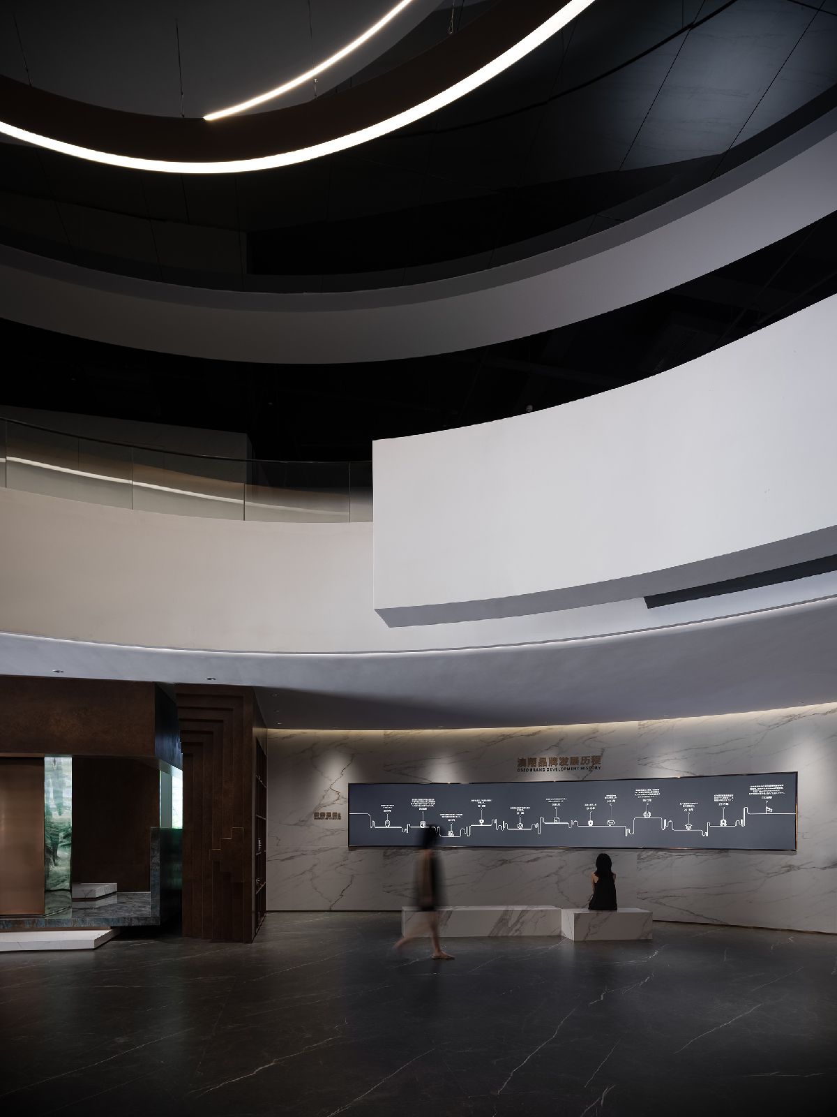
Featuring a sense of inclusiveness and softness, circle is a perfect geometric figure, as it can match elements in any shapes or forms. In addition, circle and arc offer spinning and dynamic visual effects, showing a mysterious rhythm and trajectory. The circular, hollow structure in the lobby creates a geometric aesthetic, implies the Oriental philosophy of “round sky and square earth” and meanwhile displays the trajectory of stars.
The circular lines manage to create intriguing and unexpected spatial experiences based on the combination of visual effect and principles of mechanics. A well-polished ring-shaped brass lighting fixture hangs from the ceiling in a tilted manner, showing post-industrial delicate textures. It’s more like an art installation, which breaks the limit and boundary of design. This installation is independent yet connected with the space. Moreover, it activates the spatial rhythm, while also indicating the theme and sense of artistry of the space.
Through the deconstruction and recombination of points, lines and planes, the design seems to create a dialogue with future, and express new symbolic meaning in the space. The structures present a focused visual effect through clear, direct design languages, which are recognizable and impressive. Light and shadows highlight volumes, material textures and forms, helping creating varied visual effects.
The designers not merely treated light from the perspectives of orientation, brightness or hues, but also regarded it as an entity. The curved enclosure weakens the sense of tension and adds fun to the whole space. The enclosed curve is neither as plain as line, nor as hard as folding line. Instead, it reveals a soft yet unbridled, humble yet liberated ambience. The curve outlines an independent space where people can be immersed in thinking and meditation, and also offers refreshing visual and spiritual experiences.
“Uneven Rubik’s Cube”
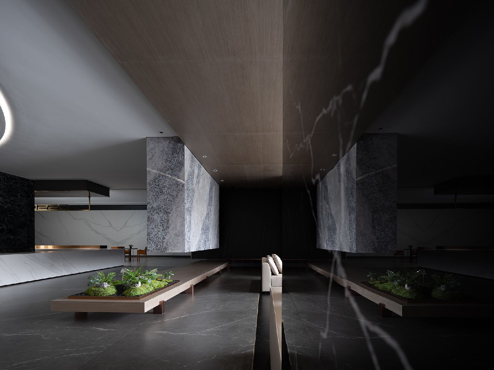
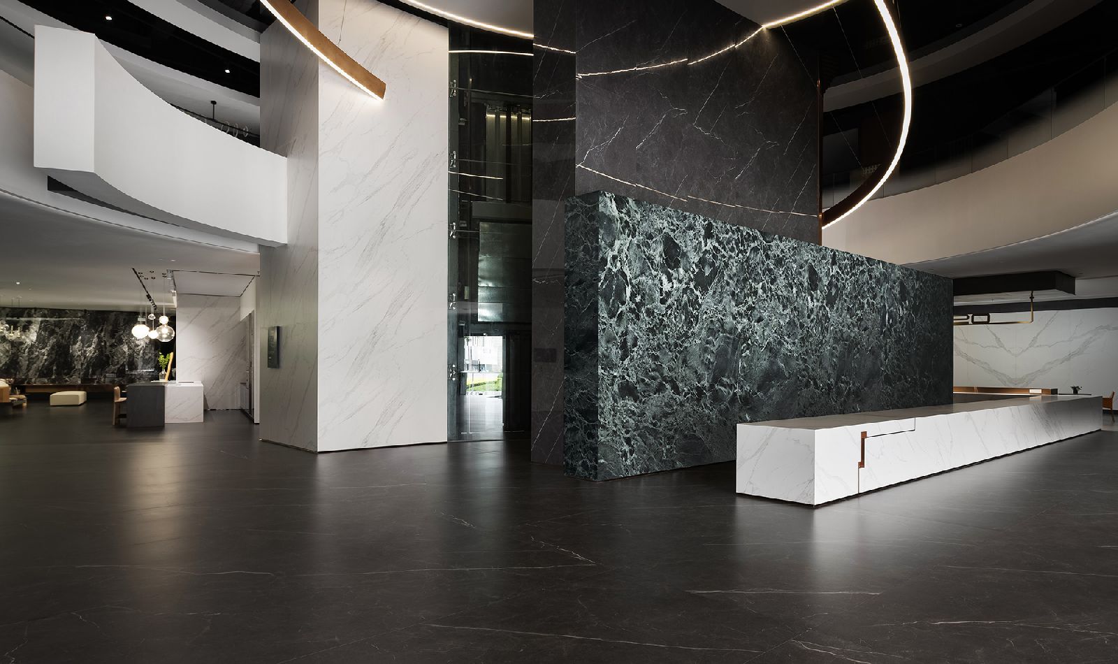
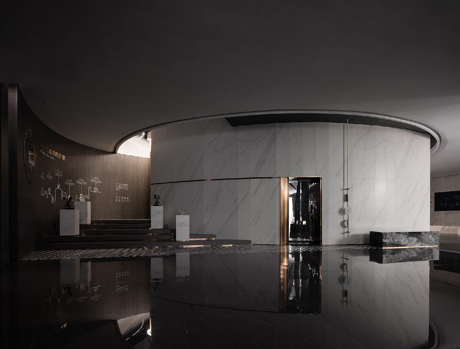
The sense of depth of the space changes with the varying light and shadows. Through the deconstruction and reorganization of structures, the designers transformed the flat walls into three-dimensional sculptures, which show a geometric, dramatic aesthetic and sophisticated craftsmanship. Through the design and organization of structures and blocks, the designers created a sense of architecture in the space.
The three-dimensional surface at stairwell entrance features integration of concave and convex forms. The sense of thickness of the wall is expressed through its two ends and by taking advantage of shadows cast by light. The original stairwell had an ordinary staircase structure. The designers deliberately enhanced and highlighted the spatial structure of the stairwell, to show structural aesthetics. Ochre-toned rust-like sintered stones match with greenish polished stones, generating a strong contrast between hues and textures.
Spiritual Retreat
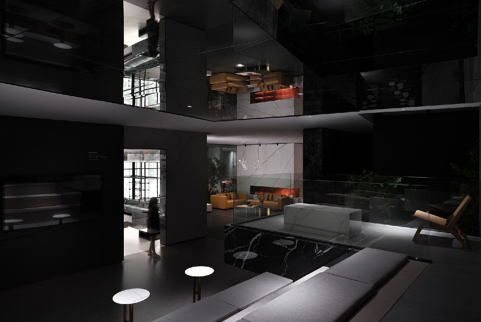
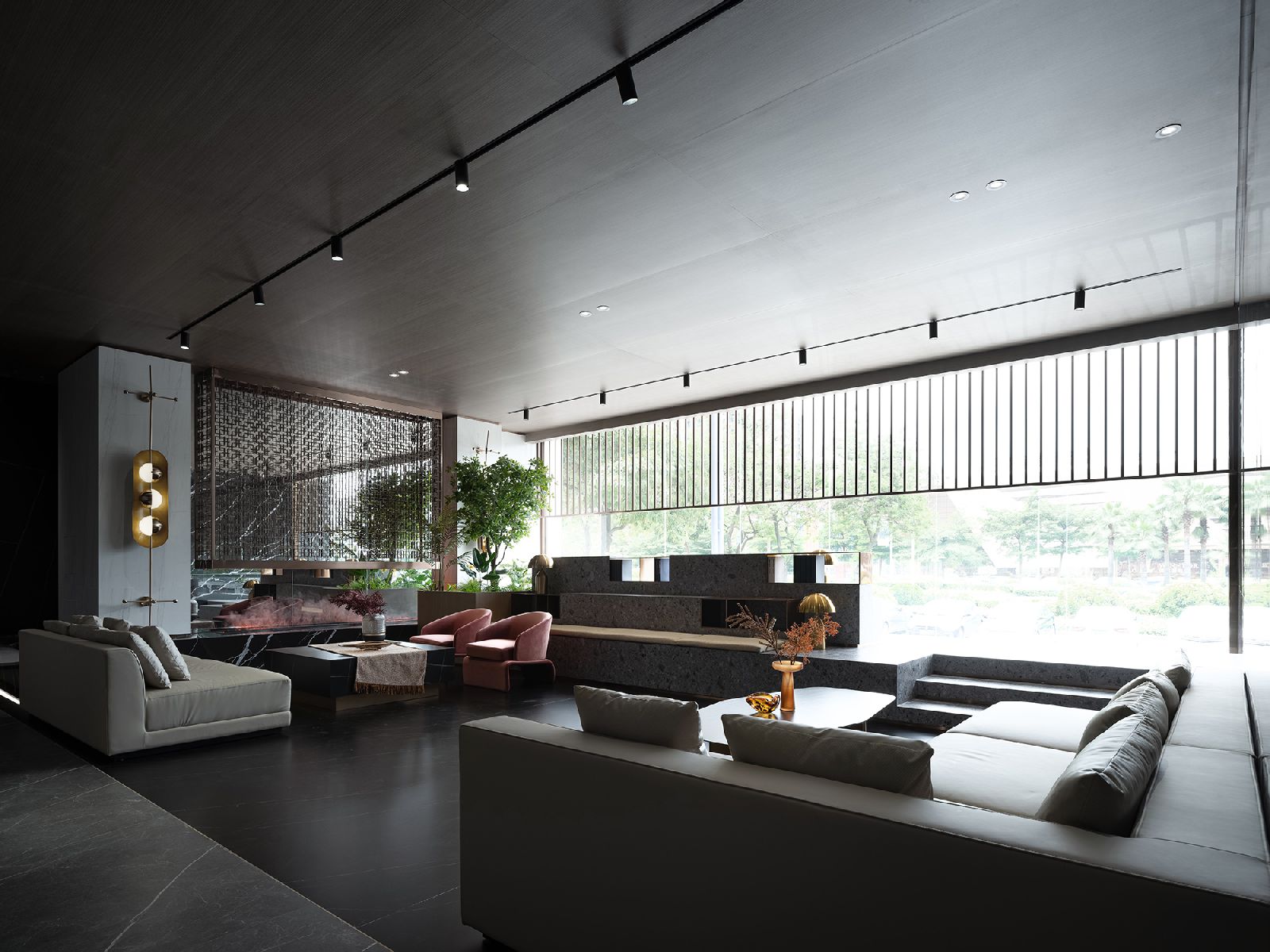
With elevated flexible platforms, the lobby bar provides a leisure space, where visitors can chat at ease and appreciate the outdoor scenery through French window. The stone seating platform with terrazzo textures adds a natural touch to the space. The metal screen and the lighting fixture show exquisiteness, conveying a sense of harmony. Structures in this area are either vertical or horizontal, enclosed or open, showing order, diversity and flexibility together with the interplay of light and shadows.
Delicate and Gentle Space
The product exhibition area mainly displays sintered stones featuring continuous grain. The spatial narrative in this area is defined by well-distributed geometric blocks. To strike a balance in this asymmetric space is complicated. The relationship between spatial volume and geometric blocks endows the space with a unique, artistic appearance.
Seams, edges and proportions were precisely treated, showing the pursuit of meticulous details and respect to users. Brass is integrated into the space in a low profile, helping enriching the spatial ambience and visual effects. And the adoption of wooden and stone materials injects gentle and detailed expressions into the space. The designers adopted simple, pure design languages to explore the dialogue between people and space.
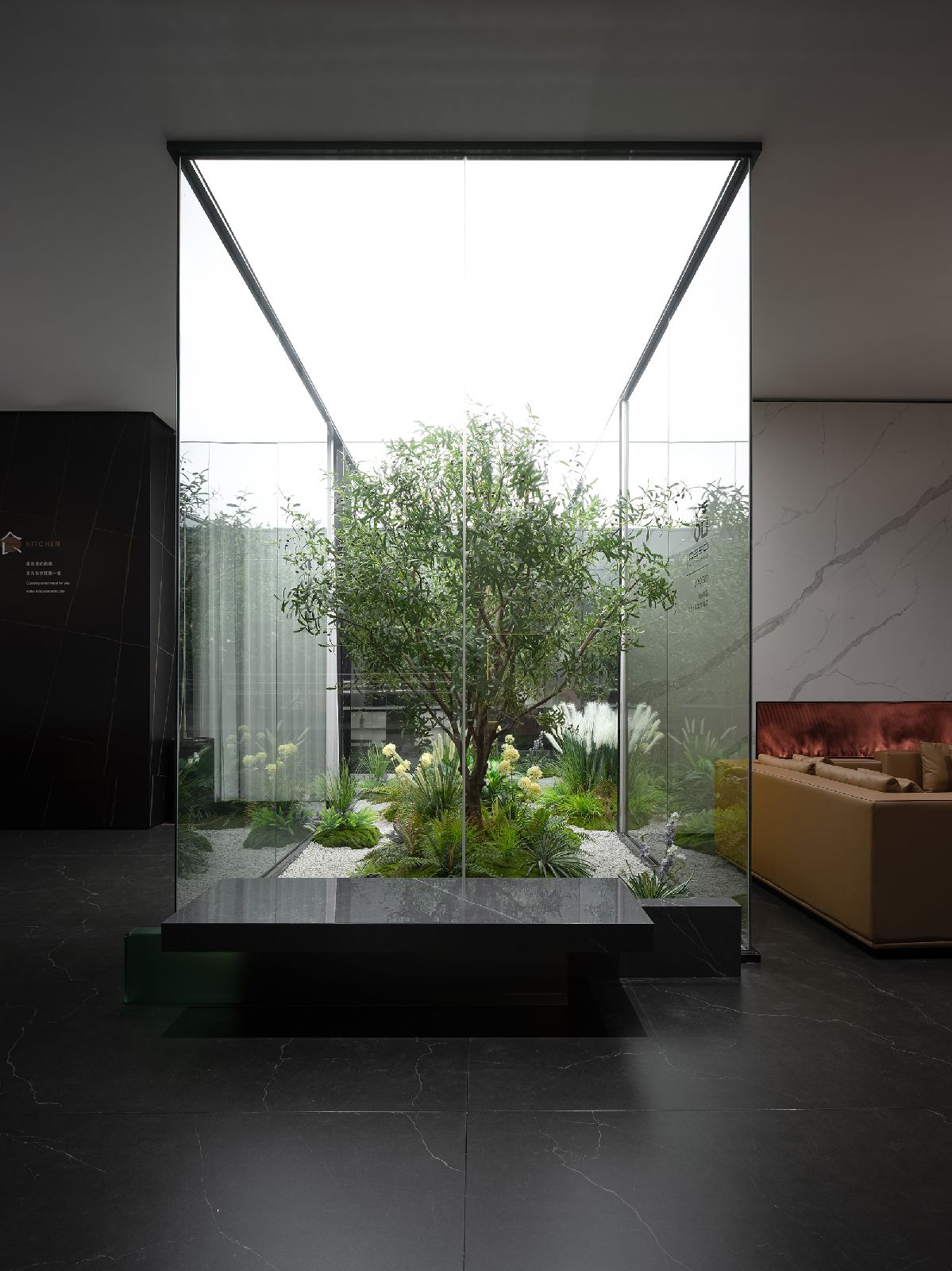
The whole spatial environment is harmonious and in a low profile. The moderate, elegant ambience is presented subtly, attracting visitors to explore further. In addition, soft hues extend to different functional areas, producing a quiet, gentle atmosphere. The private VIP negotiation area is delimited by transparent glass screens, bringing light and creating interaction among people, nature and space.
The natural transition of hues leads the sight line to outdoor natural landscape. The changing light presents a sense of elegance and eternity. Semi-open partitions were utilized to subtly enhance spatial scenes, and to convey a more open, free and gentle atmosphere. With the shift of position and sight lines, people can appreciate varied scenes. Source by Foshan Topway Design.
- Location: Foshan, China
- Architect: Foshan Topway Design
- Chief designers: Wang Zhike, Li Xiaoshui
- Design team: Lu Zhongwen, Luo Hongli, Su Jianming
- Area: 2,000 m2
- Completion time: April 2021
- Photographs: Ouyang Yun, Courtesy of Foshan Topway Design

