The Chamber Church aims to create a spatial container that both respects the past and looks towards the future. It shall provide a religious experience and secular touch. The lower part of the auditorium is divided into two parts: the semi-sunken space and the connected patio form a link to the surrounding landscape. It is embedded in the mountain and connected to the square.
It is the hidden foundation on which the upper part of the auditorium can stand proud between the mountain and the water, reflecting the power of heaven and earth and spreading the gospel of creation. Looking backwards we find the archetypes of architectural associations in history. The design echoes the memories associated with them, but interprets them in a timeless modernity creating a sense of the future. The architecture integrates this duality in plan and section.
Prototype and Tradition
To create a modern icon, we needed to create a pure shape, that’s still evokes the archetype of a church. Therefore, during the design process, we integrated different vernacular façade images of traditional churchs. The derived base volume is then expressed through a series of slices. The created contour meets the expectation of client and visitors of the space`s first visual impression. The sequential slices are introduced in a pure and modern way, whilst the gaps of the façade create various visual effects depending on the angle of the observer.
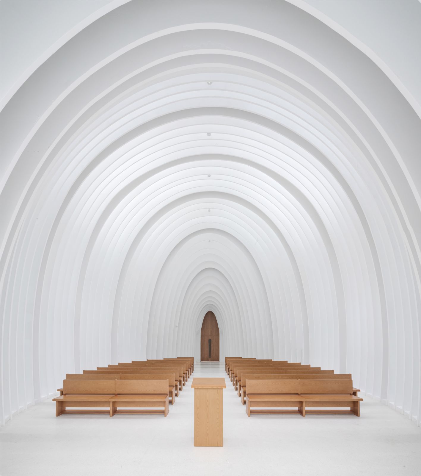
The derived prototype still features the classic components associated with a church, such as the bell tower with spire and rose window, the cascading interior arches, and the Basilica layout, but most of the decorative elements are abstracted – not out of an aversion or rebellion against ornament, but in order to reveal both the interaction of archetype and experiment, and the core issue associated with it: divinity and ritual.


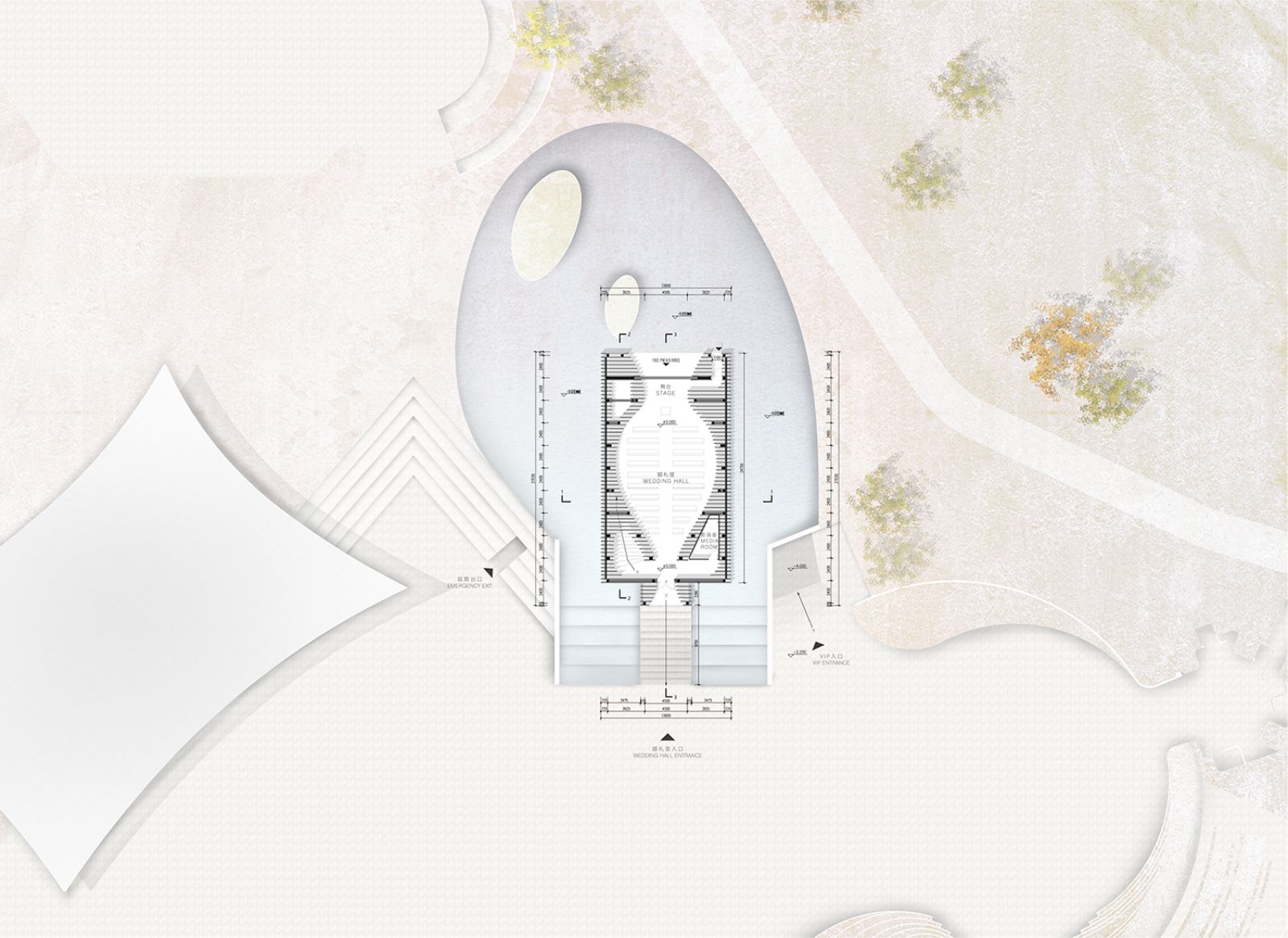
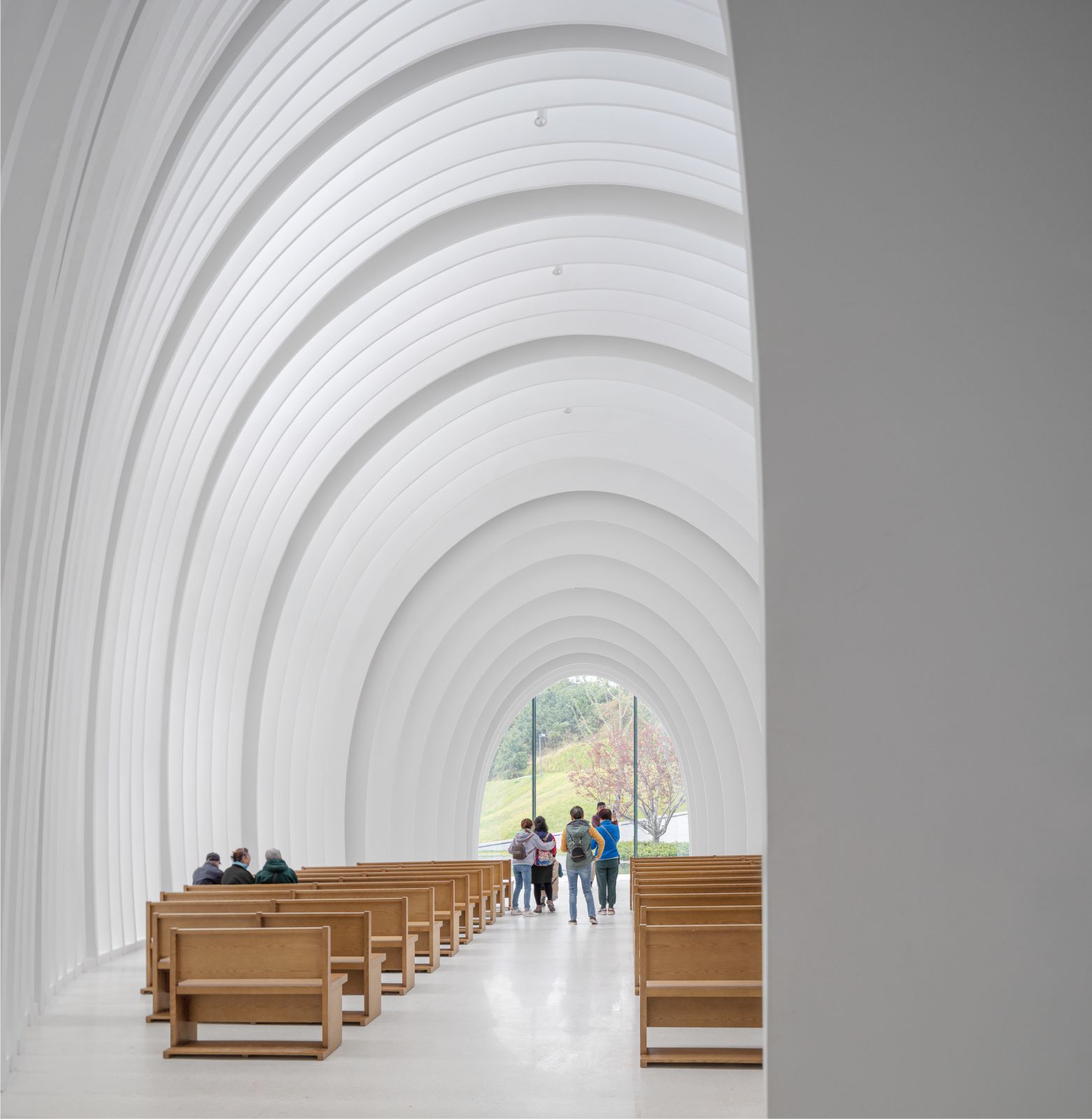
The building seeks to emulate its predecessors: the axial prolongation, the symmetrical layout, the stepped elevation, the progressive sectional rhythm, the implied basilica, these are all tributes to and an evolution from tradition. Emphasizing the traditional roots of the building and following that layout, the principal direction of the building is strictly east-west oriented. The topography changes its height at the front edge of the building, naturally dividing the surroundings into a plaza in front and a sloping landscape with a manmade lake behind the building.
The landscape part of the exterior features an artificial lake to create privacy, while the open space of the plaza emphasizes the relation to the public. The change of height between building and plaza is bridged by large water feature steps. They form a visual base to further strengthen the sense of ritual and sanctity of the main hall. The lower part of the building serves as an auxiliary space for the main sanctuary, including the reception desk and preparation room. The path towards the main entrance of the church leads past the southern side to the western portal.
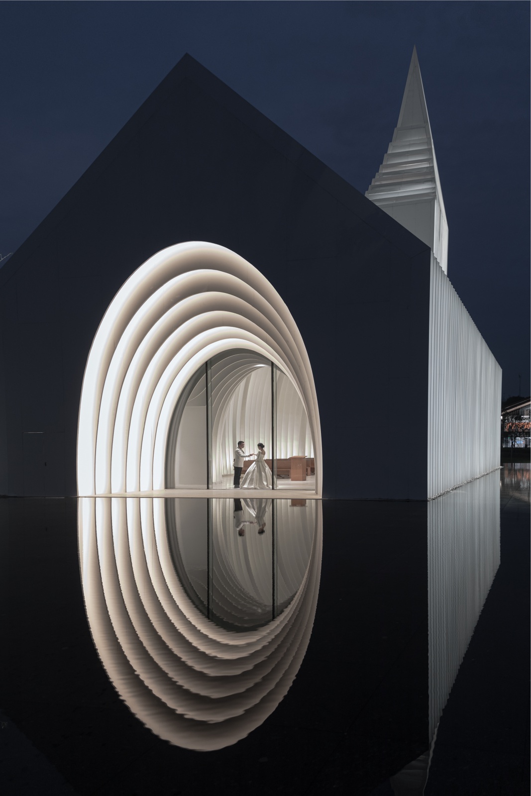
An alternative access exists on the north western part of the plaza, where a direct connection to the VIP facilities in the base exists. The back view seeks to break the rigid impression of the building edge, and forms a fluid connection to the lake. The strategically placed island creates a counterpoint to the central axis of the hall, diffusion the symmetric tension. The program favors a more inward-looking approach. Taking advantage of the series of landscapes slopes that block the view behind the calm lake we use that as a passive space to look at from inside the hall.
In front of the church entrance, we create a “stage” to emphasize its central position. Before the advancement of construction technologies, caves were the first sheltered spaces for primitive humans, offering refuge from cold, wind, rain, sun and dangerous animals. Their encircling form is deeply embedded as a sign of security in humanities DNA. This sense of security was worshipped with the development of human civilization, which led to the early enshrinement of its origin, the cave, as a sacred place of ritual, such as the Caves of Lascaux (Grotte de Lascaux) or the Cave of Hilla (Jabal al- Nour).
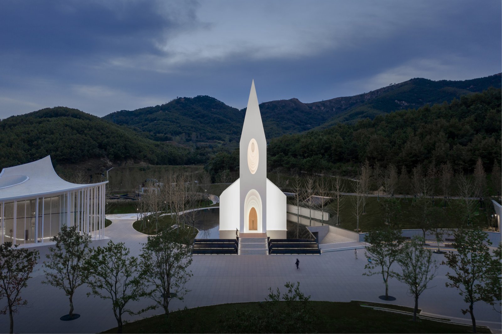
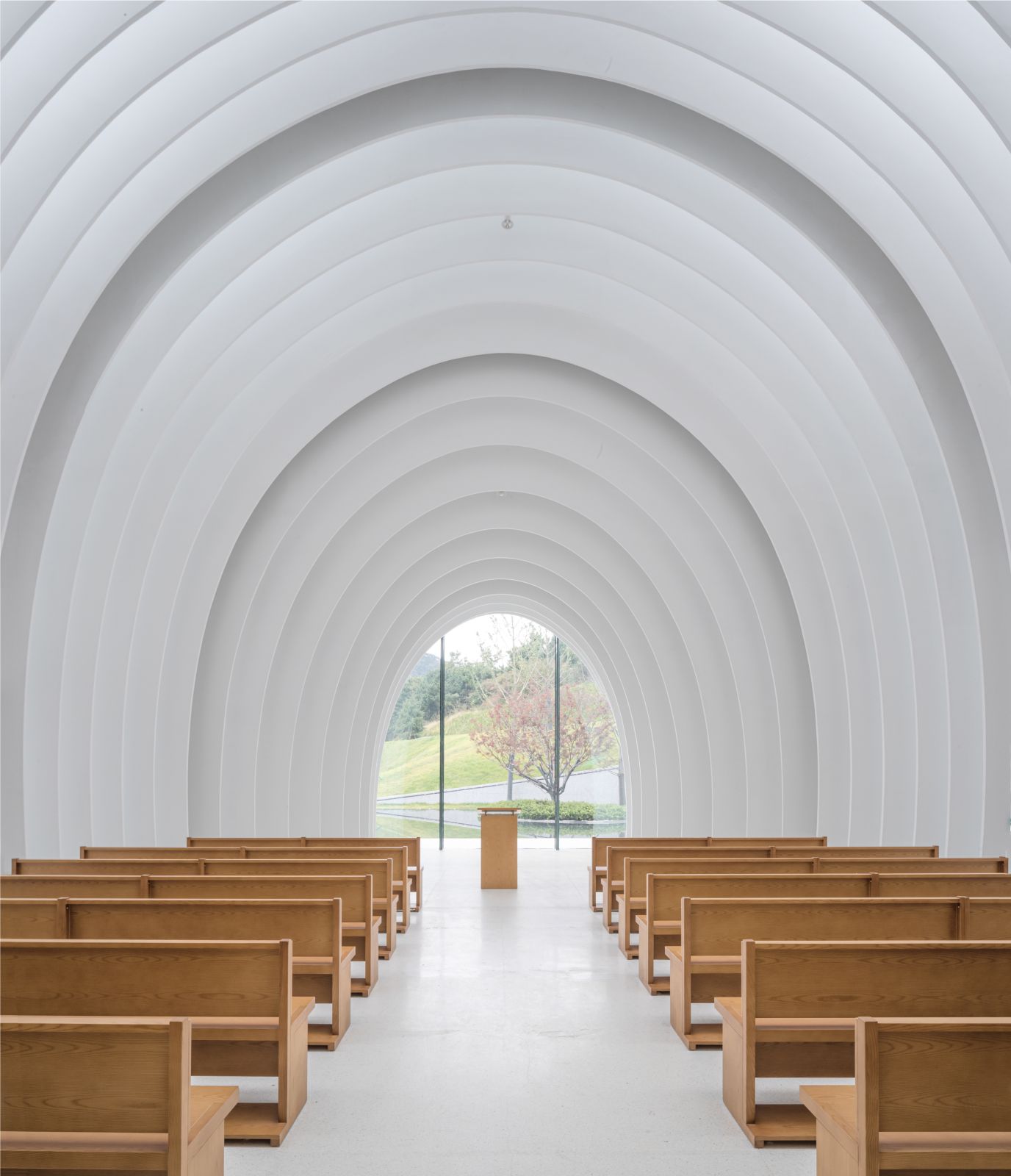
The cavernous space of the assembly hall thus attempts to give people a sense of peace and shelter in the form of an enclosure, just as the cave once did. It again provides a frame for the ritual and sacredness desired by the people holding the ceremony, thereby triggering a connection between the real and spiritual dimensions. The interior space of the assembly hall is a soft, flowing cavity that creates an interesting detachment from the sharp geometric exterior contours. Its construction creates at the same time a cavernous space and a bright ambience.
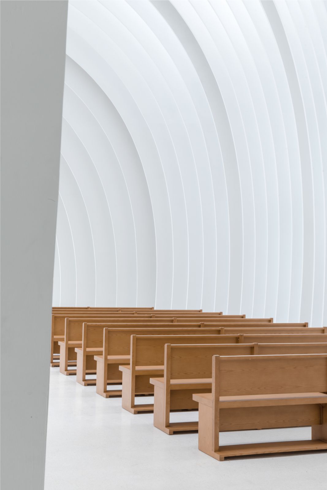
The entire building is sliced at uniform intervals along the longitudinal axis. The created gaps allow the light to enter. As it passes between the white slices, it reflects back and forth between them and then spreads evenly and softly into the interior. Throughout the day, the changing angle of the sun and its relation to the gaps and interfaces create varying visual effects. The play between direct and reflected light gives the “cave” a sense of divinity and elation. The intention behind the cave is to form a space of shelter and of spirituality.

An Intention best conveyed in Leonardo da Vinci’s famous painting “Virgin of the Rock”, where in a sheltered space of pure light, one can feel the love of creation for all beings. The softly curved interior follows a traditional basilica layout with a more contemporary interpretation. The remaining blades after the substraction of the inner and outer contours allow the building to be softly lit at night, and offering passers-by to feel the sacred light emanating from within. The form is constituted in a unique way: a series of aluminum (outside) and GRG (inside) slices arranged vertically, each 5 cm thick, with a gap of 40 cm between each slice. All these slices are combined to form the entire wall, roof and tower.
The cascading white slices soften the interior light while wrapping the main frame and construction system of the building, giving the entire assembly a concise and austere atmosphere, which is both a contemporary aesthetic tendency and an echo of tradition – a fusion of heritage and contemporaneity. In this setting the observer defines his experience: The look forward to the congregation closes the slices and emphasises the void of the cavern and the unity of the people gathered. The look towards the skies is unobstructed at every place in the hall and connects the individual to nature and heavens, resulting in an archaic form of modernity.

Structure as an underlying element is always implemented in the layout of architectural space. From the dome and flying buttresses of traditional Western churches to the large gables and flying eaves of Chinese halls; the shaping of ritual space is always accompanied by the expression of the structure of the space. As a ceremonial space, we believe that the internal logic from form to construction should be simple and pure throughout the design of the Chamber Church.
- The main space of the building, except for the bell tower, adopts the structural form of a series of portal steel frames, which are positioned in correspondence with the white architectural slices, making them slices truly the subject of the formal language and spatial structure of the main hall. At the same time, it also responds to the traditional church prototype from a structural point of view.
- The portal steel frames consist of 11 sets of main frames, and 10×6 sets of sub-frames between each set of main frames. The main frames define the horizontal outer contours of the church, while the sub-frames, assisted by the girders, define the cavernous spatial contours of the interior of the hall. The two contours also form the basic relationship between the external rigidity of the building and the internal softness.


3. The connection between the series of portal steel frames is achieved by two levels of structural bars: the main beam runs through and ties all the steel frames together, while clearly outlining the longitudinal outer contours of the church. The secondary beams differ from the main beams in that they have been deliberately misaligned in the design. On the one hand, the spacing between the bars is reduced without increasing them, making the whole building form a box-like structure. The expression of the structure is alienated and dissolved in the longitudinal direction, while the spatial progression formed by the horizontal portal frame in the longitudinal direction is enhanced. On the other hand, the secondary beams become the backbone of the façade structure at the same time, achieving the integration of skin and structure.
The design attempts to go beyond the symbolic functional definition of space, to shape a place of relaxation with the abstract idea of elements, and then to give the space a richer content of location through the users’ behaviors. In contrast to the traditional concept of floor function, the 60 separate and gradual slices can be regarded as 60 independent sections. The variation of sections makes the outside of the Chamber Church traditional and hard; while the inside, due to gradual cavity, becomes emotional and soft. Source by BUZZ / Büro Ziyu Zhuang.
- Location: Qingdao, China
- Architect: BUZZ / Büro Ziyu Zhuang
- Principal Designer: Ziyu Zhuang, Fanshi Yu, Fabian Wieser, Na Li
- Design Team: Mengzhao Xing, Jialin Song, Yingliu (Intern), Yi Liu, Dongdong Chen, Weihong Dong, Yubing Chen, Zhendong Chen, Di Tian, Ruoyi Song, Nan Zhou (Intern), Lingwei Meng (Intern)
- Construction Drawings: Qingdao Tengyuan Design Institute Co., Ltd.
- Construction: Qingdao Jiuan Construction Groups
- Interior Construction Drawings: Gold Mantis Construction Decoration
- Interior Construction: Ganghua International
- Landscape Design: ASPECT Studios
- Landscape Construction: Guangzhou Yayue Landscape Construction Co., Ltd
- Structure Consultant: Hejie Architectural Consultant
- Lighting Consultant: Puri Lighting Desgin (Fang Hu, Yanhui Li)
- Curtain Wall Consultant: Forcitis
- Steel Structure and Curtain Wall Construction: Shenyang Lidong Curtain Wall Decoration Co., Ltd.
- Main Materials: ALUCOBOND PLUS Aluminum Composite Material-ALUCOBOND;GRG-Beijing Yongxinsheng International Architecture and construction Co., Ltd.;Low-E Glass-Tianjin Nanbo Energy-saving Glass Co., Ltd.
- Client: Sunac China Holdings Limited
- Floor Area: 770.91 m2
- Completion: 2021.9.24
- Photographs: Schran-Shengliang Su, Courtesy of BUZZ / Büro Ziyu Zhuang


