Background
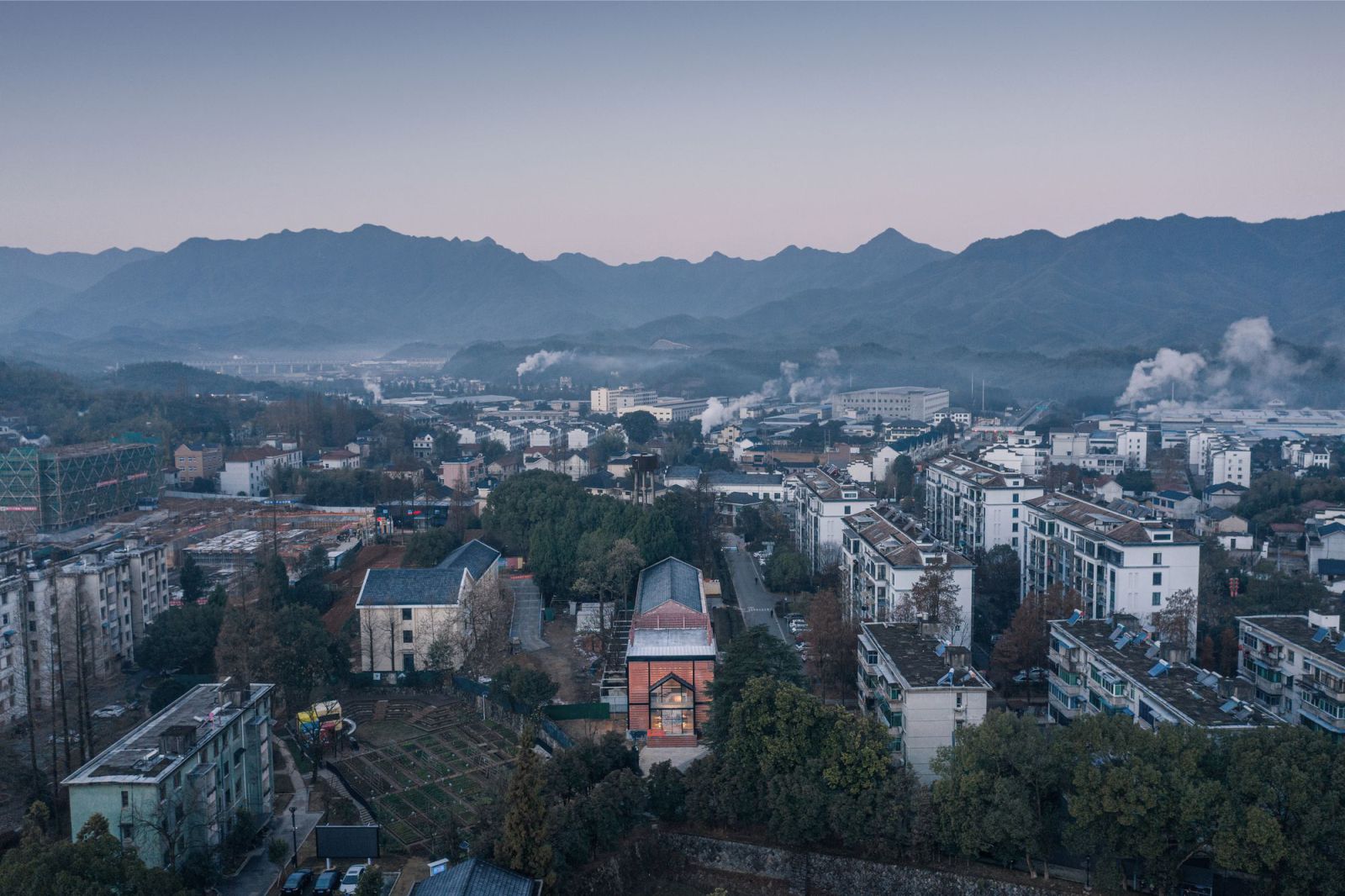
The project is the repurposing of two buildings, a one-story pitched roof warehouse in disrepair, and an abandoned two-story flat roof storehouse. It’s located in Huangnishan community, a residential quarter for pyrite workers which was built in 1959 and now accommodates more than 500 households and 1,000 people. In 2019, Huangnishan was chosen as the site for piloting a rural revitalization initiative centering on constructing a “Rural future community”.
During the first phase of implementing the initiative, many facilities such as entrepreneurship commune, shared library, smart sports field and shared canteen were inserted into the community, which has gain popularity among local residents. Those facilities have given a new life to old idle buildings, and have stimulated the vitality of the community. In particular, the shared canteen and the smart sports field have brought a lot of convenience to local residents.
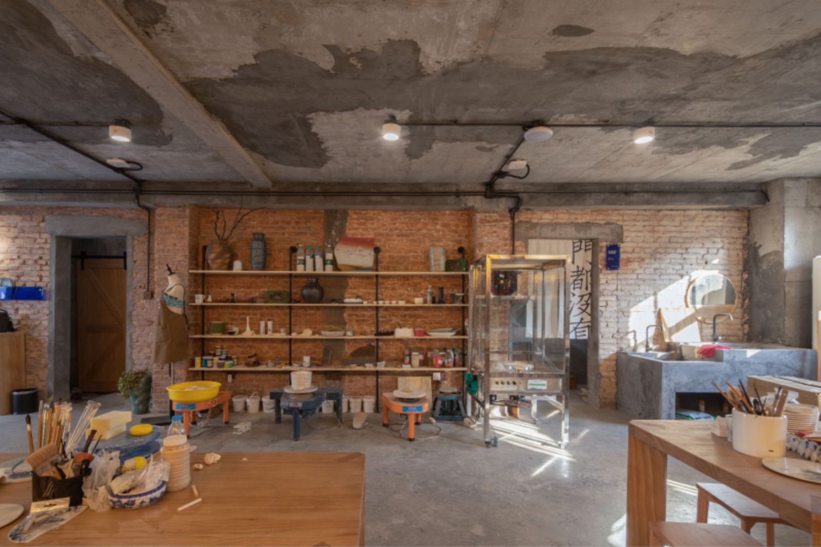
The second phase of the “Rural future community” initiative inherits the concept of phase one. It’s intended to improve and supplement what was lacking before, and to activate unused spaces. This project is a part of the second phase of the initiative. After fieldwork and discussion, we decided to convert the two warehouse buildings into a multi-functional gym and a ceramic expert workshop, to bring in new operations and enhance availability for the public.
Fusion of the old and new
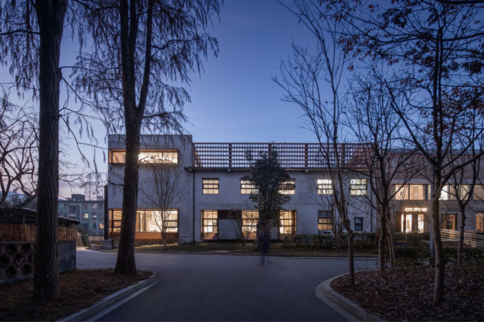
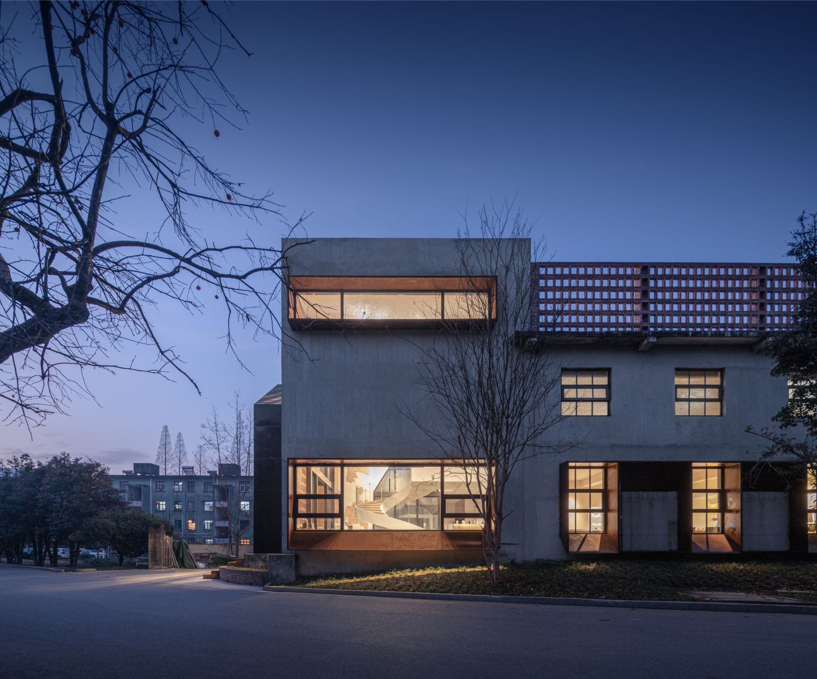
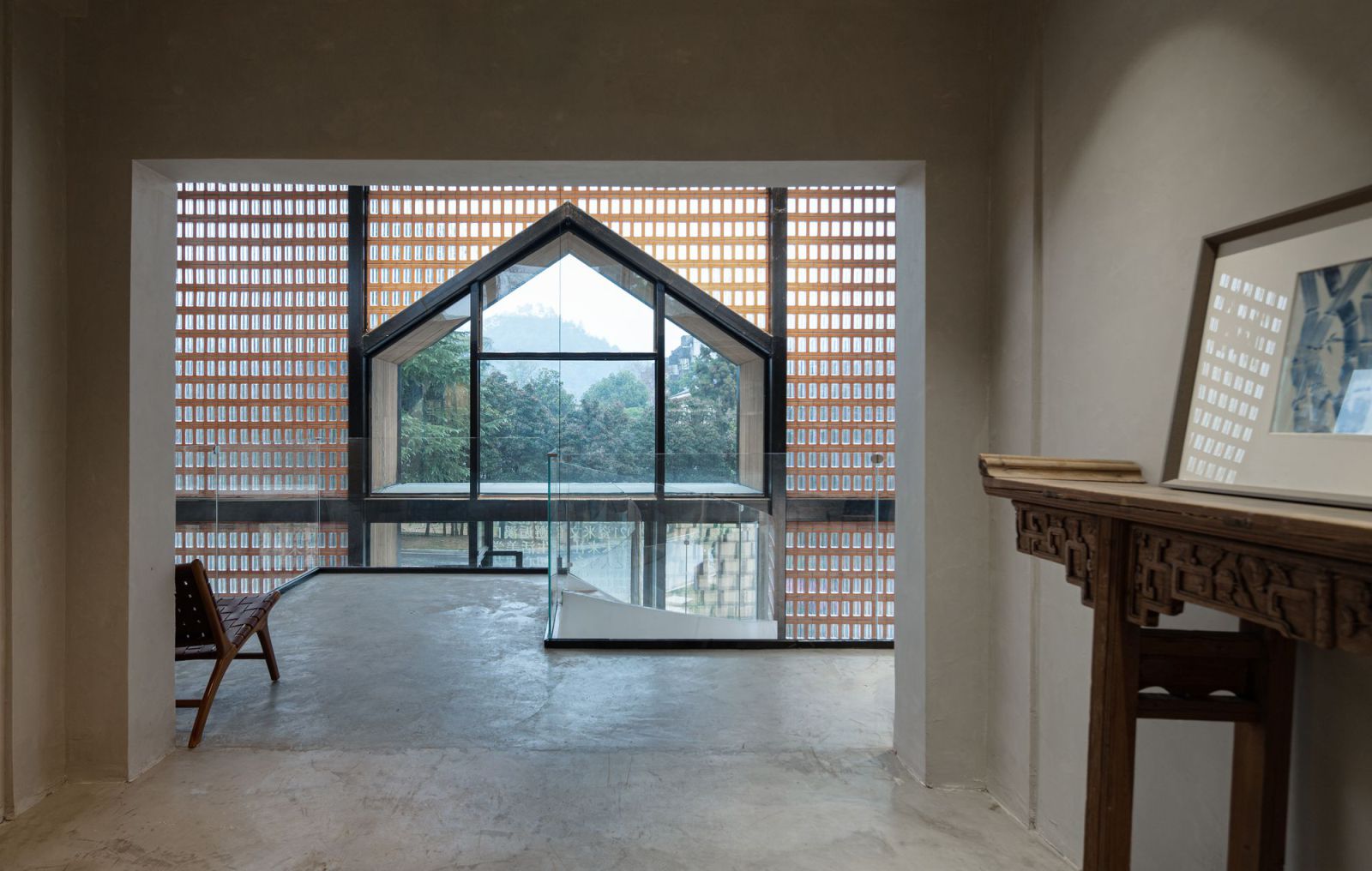
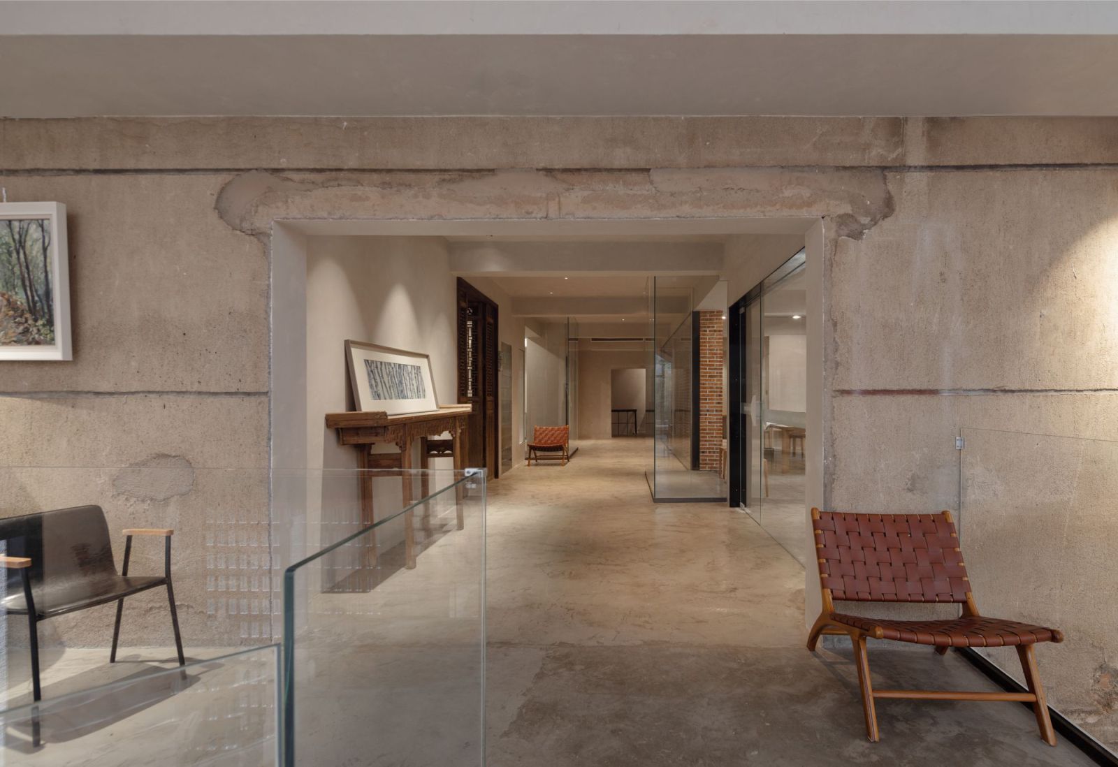
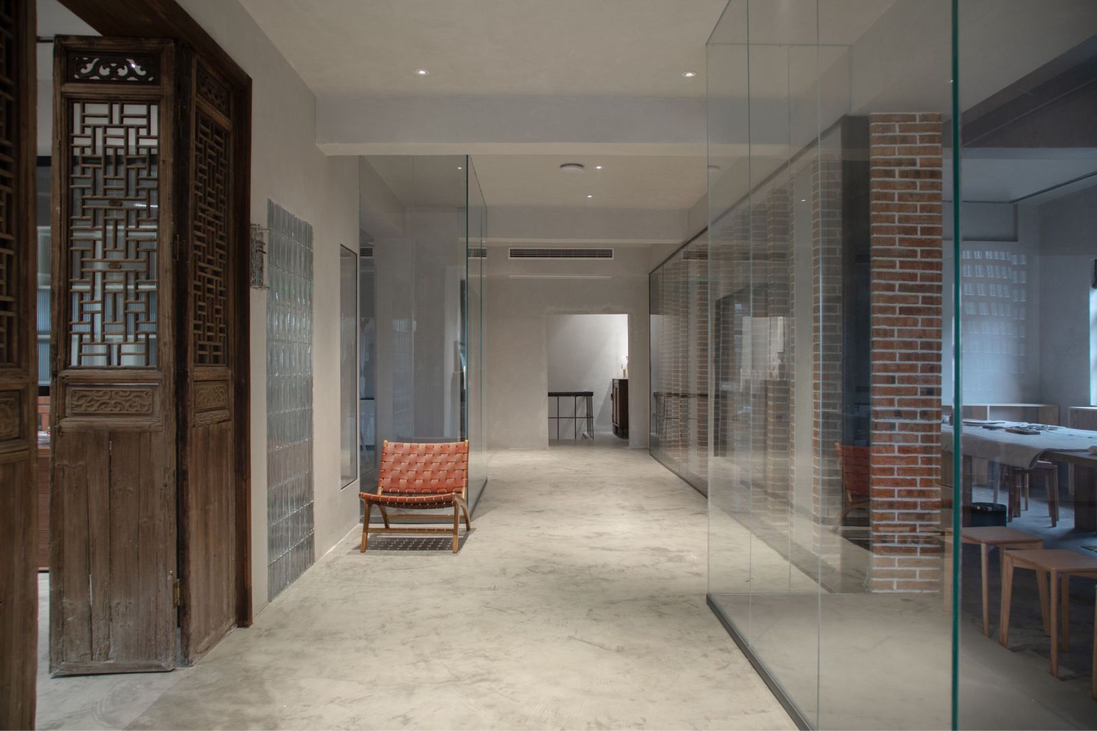
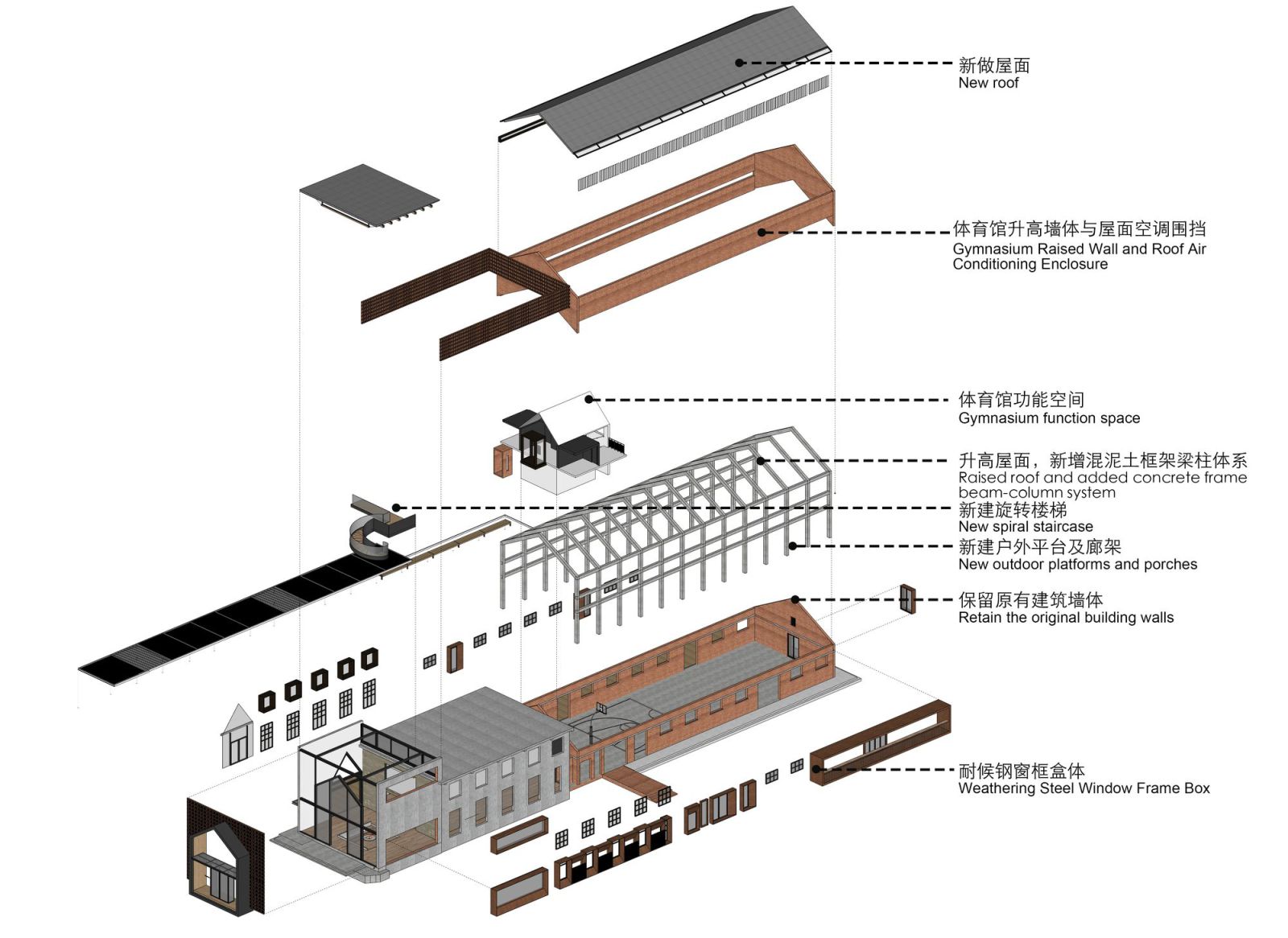
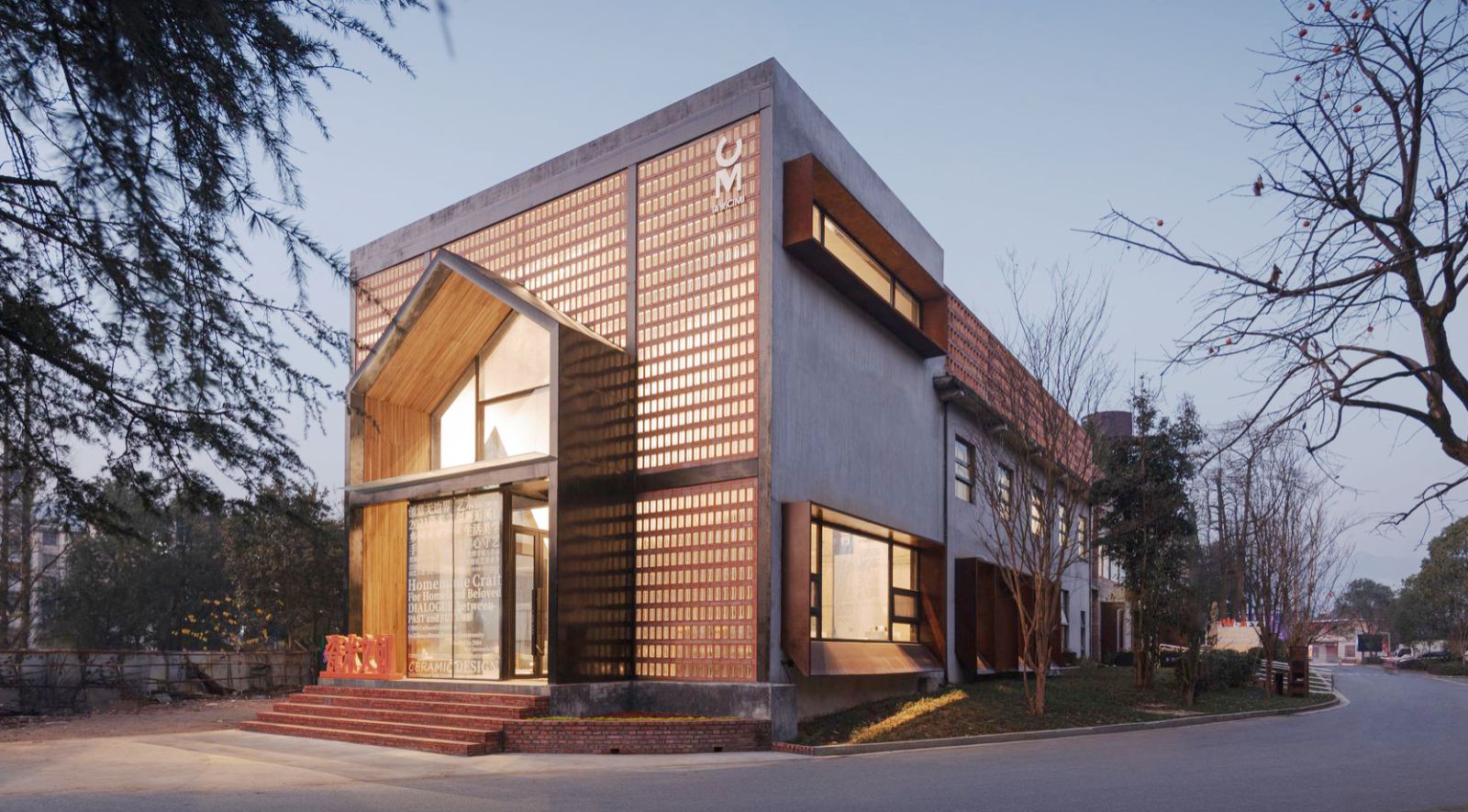
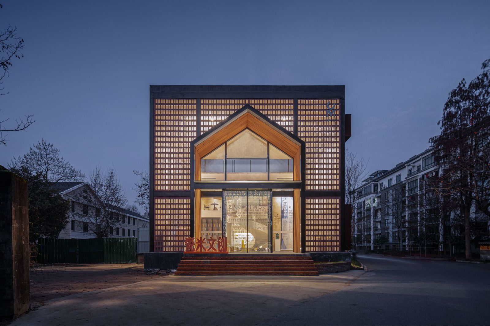
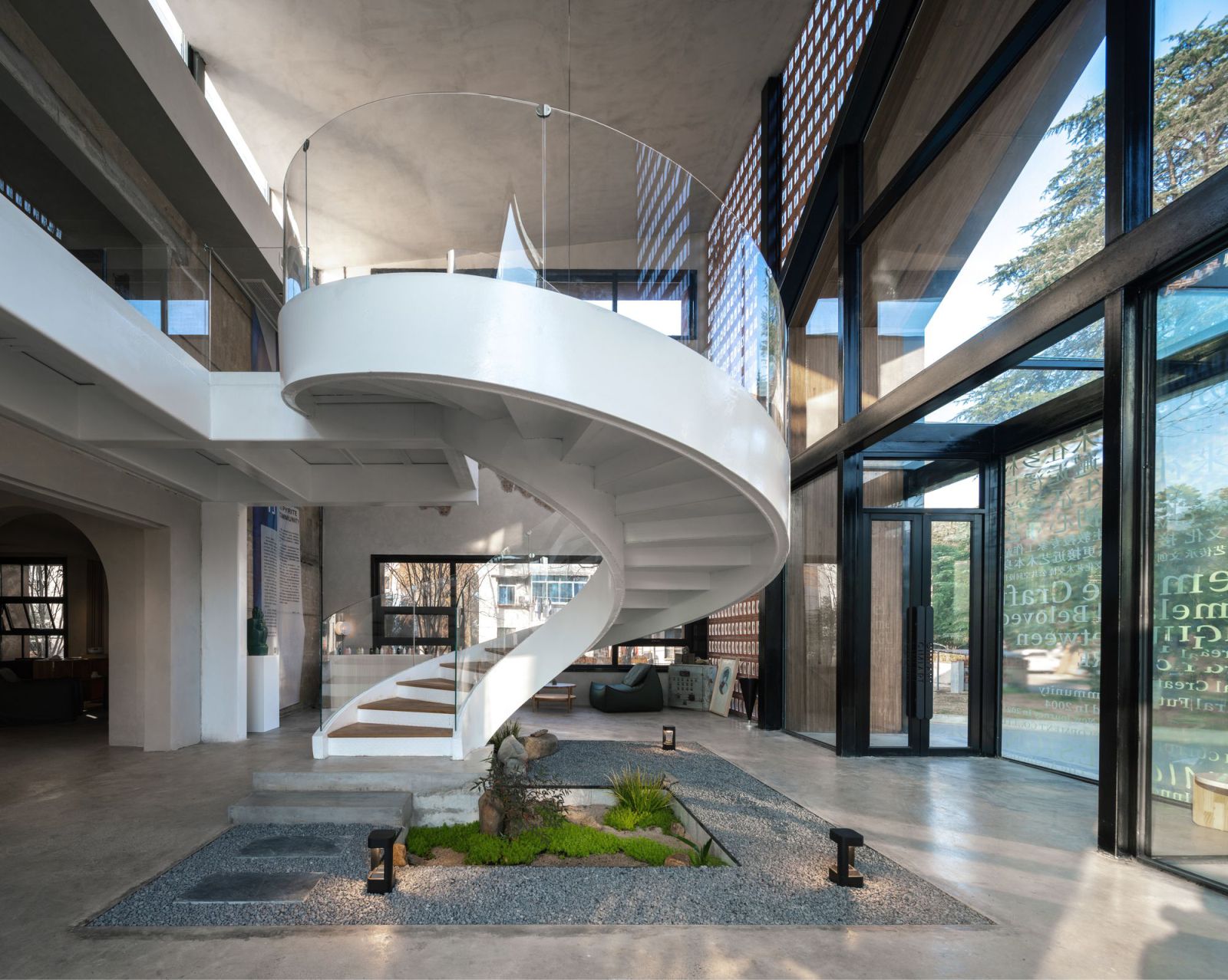
Carrying past memories while meeting the demands of modern and future living was a major requirement emphasized by the client at the preliminary design stage. Based on the site’s conditions, we reorganized the functions of the two buildings. The two-story flat roof building is transformed into a ceramic expert workshop, and its old staircase is removed to re-establish the vertical traffic which is combined with a newly built lobby.
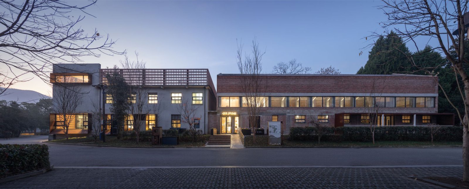
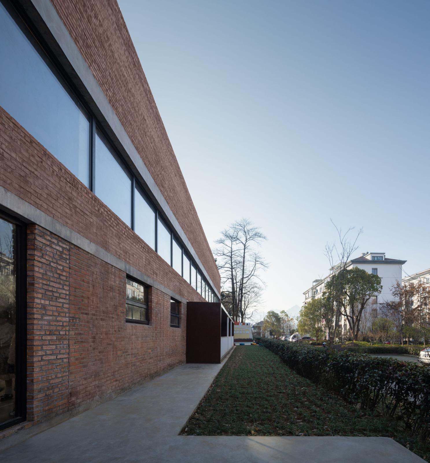
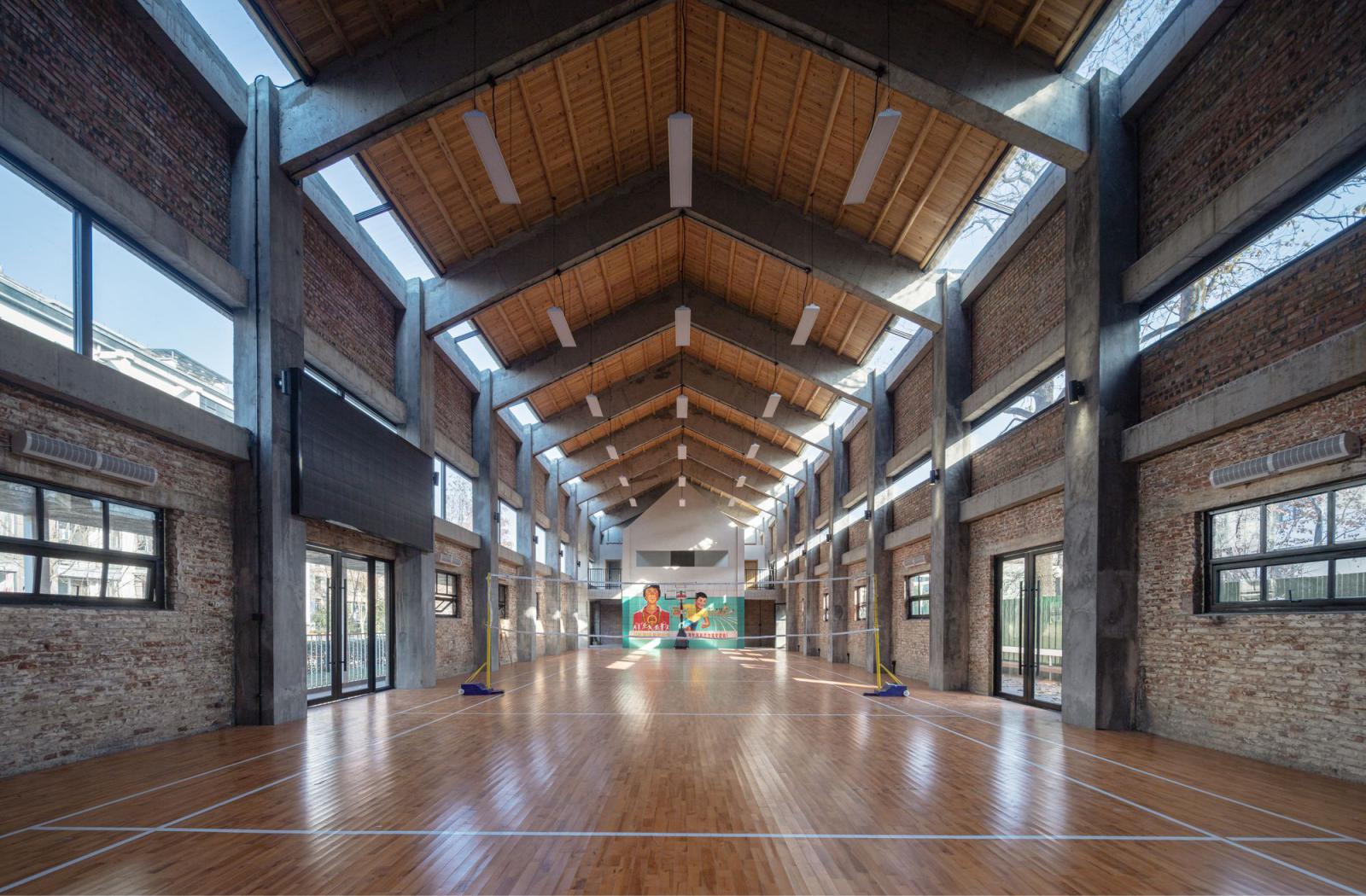
The one-story pitched roof building is converted into a multi-functional gym. Considering its limited height, we dismantled the wooden roof and raised the height of walls to build a new roof. Meanwhile, new functions such as bathroom and shower room are also inserted into the building. In terms of material selection, we adopted the design strategy of “continuity”.
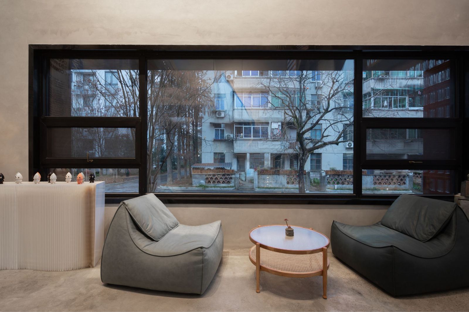
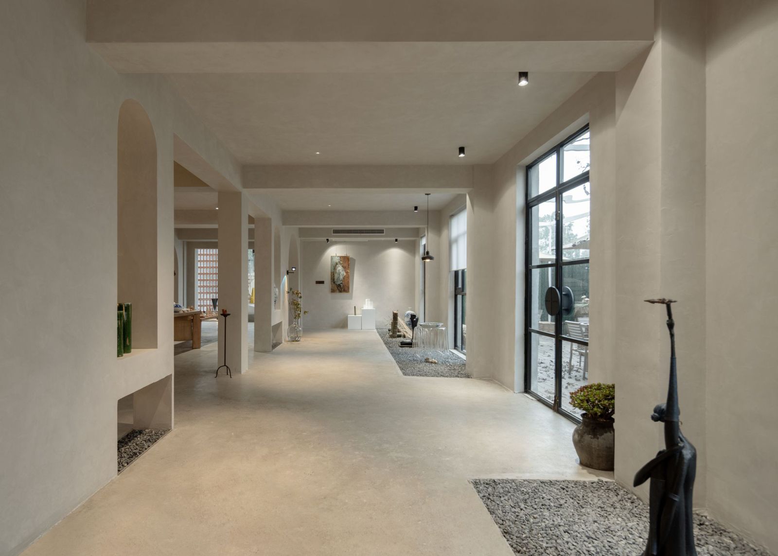
We utilized red brick to set the main tone while combining it with mottled weathering steel, to blend new textures into the old buildings in a harmonious way. We also adopted some modern materials such as glass bricks and glass windows to harmonize the dullness and monotony of the buildings.
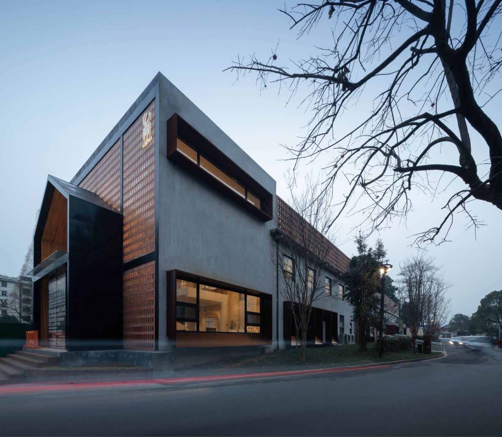
In addition, we superimposed new elements on the old existing components to ensure integrity and harmony between the two buildings. The outdoor activity platform and corridor enrich the usability of the space, allowing users to move to the outdoor space after sports and work and enhancing the connection between the buildings.
Simple aesthetics in daily use
It’s often the case that the spatial status of a project is quite different when it is just completed and after it’s delivered to operator or users, which is due to distinct aesthetic taste and usage habits. Therefore, in design practices, we often think about how to maintain the aesthetics of a space in its daily use in a natural manner rather than deliberately or inflexibly.
At the preliminary design stage, we set the framework and principles, and try not to adopt too many fixed or deliberate designs or materials, in order to ensure the flexibility, diversity and possibilities of the space, hence leaving more possibilities for users. Many public projects are left unused and abandoned after renovation, causing a huge waste of social resources. At the beginning of this project, we attached great importance to the use of space and the insertion of operations.
After it was completed, we see that the multi-functional gymnasium is fully utilized by the surrounding residents — young people playing basketball and badminton here and senior residents dancing. More fortunately, the users of the space not only meet the expectation of the initial plan, but also show good artistic attainment and aesthetic taste. Even appearing messy in special use, the space can still reveal a true aesthetic that integrates into daily life. While maintaining the aesthetics of the space, this project gives the old buildings a new life. Source by y.ad studio.
- Location: Xikou Town, China
- Architect: y.ad studio
- Chief architect: Yan Yang
- Designer: Wu Kejia
- Architectural design collaborator: Shanghai Times Architecture Design Co., Ltd.
- Interior design development: ZONE DESIGN
- Construction drawings: Hangzhou Zhongya Architectural Design Co., Ltd.
- Design & construction management: Zhu Zhen, Gao Chengkai, Jia Yidong
- Commissioner: People’s Government of Xikou Town, Longyou County
- Project area: 1,080 square meters
- Construction phase: March 2021– December 2021
- Photographs: SCHRAIN, Courtesy of y.ad studio
