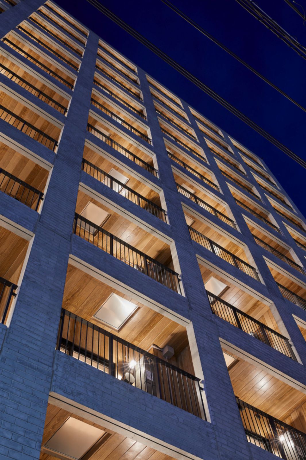
Apartment blocks sprang up across Japan after World War II, and by 2019, there were over 6.6 million units nationwide. Large buildings with over a hundred units, such as this one, significantly impact the appearance of the urban landscape. Many large multi-unit buildings have continuous balconies along their facades to improve the efficiency of emergency evacuations, and outdoor air conditioners are often placed on these balconies as well.
This gives rise to the characteristic look of many apartment blocks, with balconies running the length of each floor punctuated by dividing walls between units. Beginning in the 1980s, developers began using tiled facades to give their buildings a classy appearance and improve marketability. But while tiling did raise the value of the units, in recent years accidents involving falling tiles have become a problem.
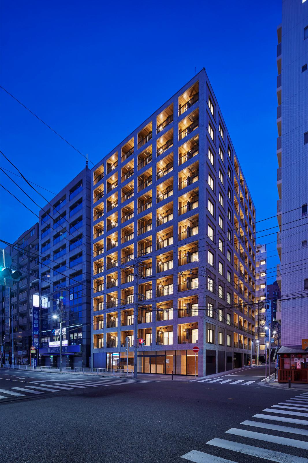
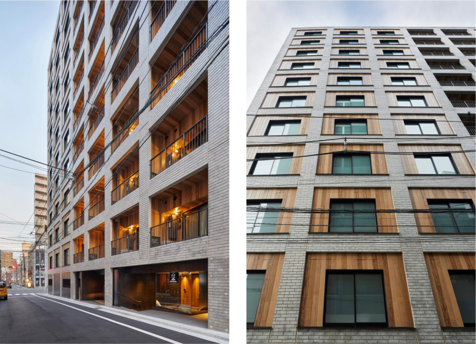
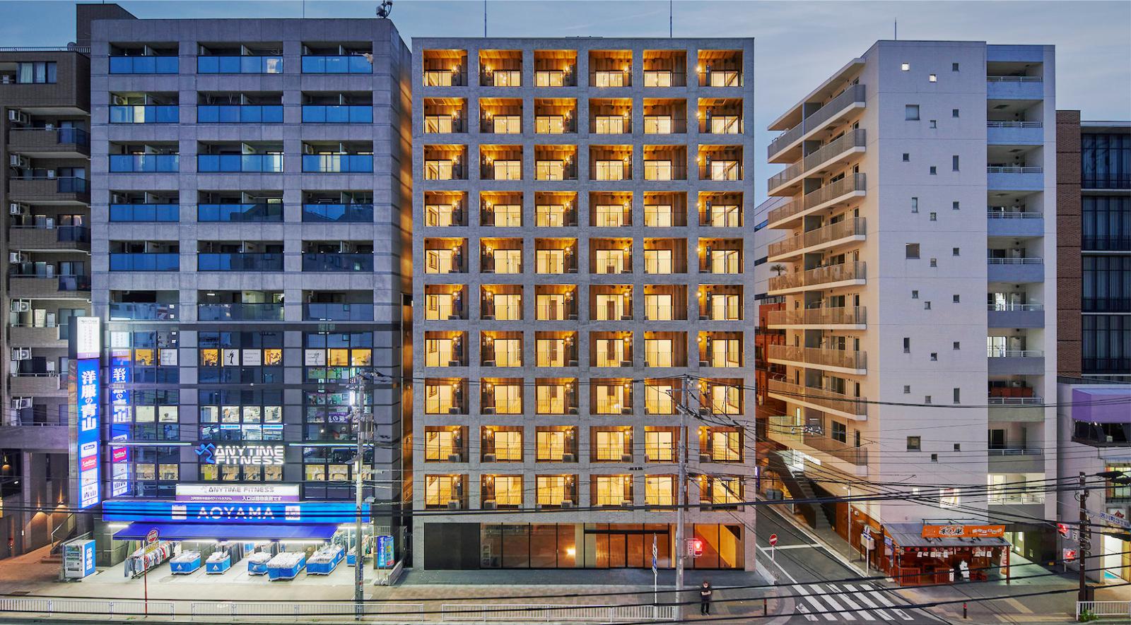
This project seeks to redefine the familiar balcony-and-tile apartment block with a new look. The facade of the residential portion of the building, which starts on the second floor, does indeed feature balconies across the length of each floor. However, an outer skin punctuated by evenly spaced openings wraps over the balconies, blending the upper floors with the commercial-use first floor and lending ambiguity to the facade, which could just as easily conceal a business complex as a residential one.
Instead of tiling the exterior, we used concrete imprinted with grooved formwork to reference the appearance of Yokohama’s classic brick buildings. A clear coating makes the concrete look like grey brick from a distance. We initially considered finishing the inside of the balconies with wood paneling, but due to the challenges of maintenance in apartment blocks, we settled on concrete imprinted with vertical grooves at intervals the width of wood panels.

A light undercoat and darker topcoat were applied to the concrete, which was then scraped with a wood-graining tool before the stain dried to replicate wood panels. In this project, an ambiguous concrete skin serves multiple function: referencing urban history, contributing to the cityscape, revitalizing the community, adding value for buyers and sellers, and easing maintenance.
The texturing trowel, which was formed with a relief pattern of simulated growth rings, could “create” woodgrain with a diagonal run. A darker coat of paint was then applied, to which the woodgrain-texturing trowel was run lengthwise to reproduce a wood-paneled finish on the concrete surface. Definitely fake but definitely hand finished, the expression exudes warmth.
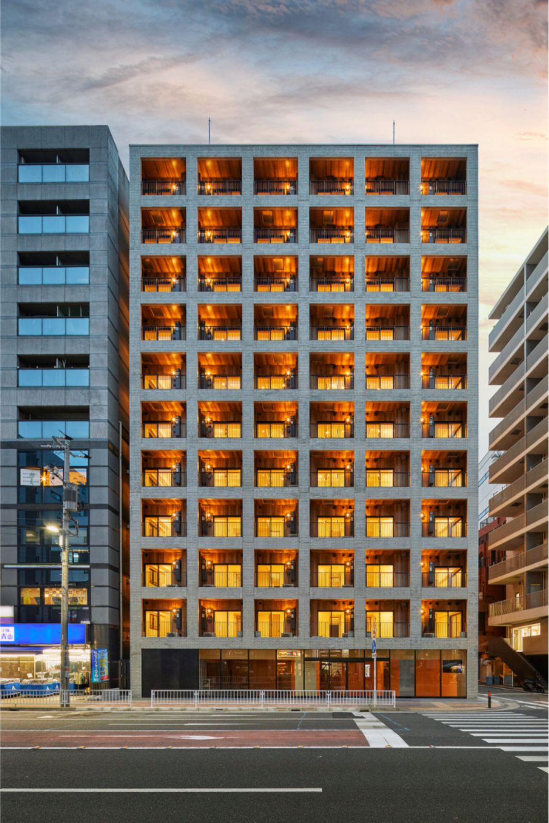
For the street front, the convenience store on the ground floor was partially sunk below sidewalk level to secure ceiling height required for a commercial facility and to match the exterior wall modularity of the upper residential levels. The Firebreak Building was thus completed without splitting the façade between commercial and residential levels. The entrance to the residences on the side street defers main-road access to the convenience store and reserves privacy.
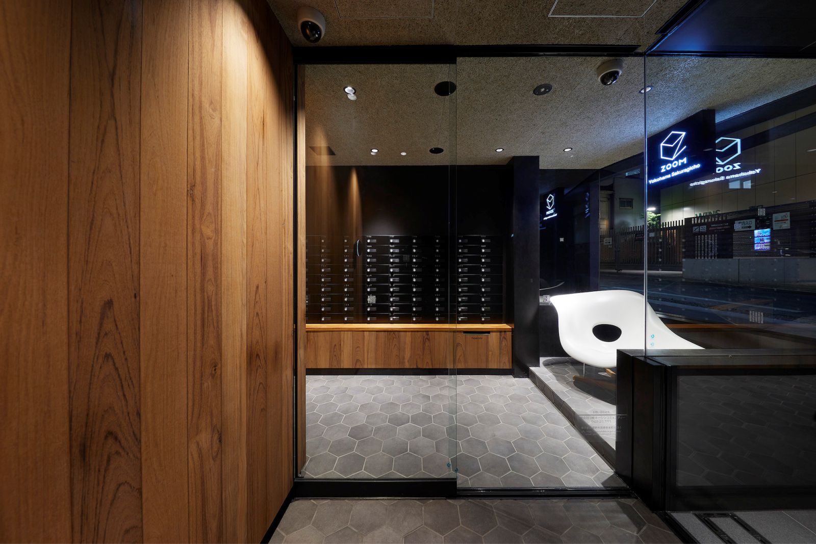
The entry hallway is finished inside contiguously with the balcony wood cladding; however, since the interiors of this common area come into contact by hand, real wood veneer was selected. Hexagonal floor tiling, finished walls, cemented excelsior board for the ceiling, and illuminated indoor signage visible through exterior glass are features with an intentional commercial feel. Source by Akira Koyama + KEY OPERATION INC. / ARCHITECTS.


- Location: Yokohama, Kanagawa Prefecture, Japan
- Architect: Akira Koyama + KEY OPERATION INC. / ARCHITECTS
- Execution Architect: X-ARC Urban Architects
- Contractor: Daisho Structure, TERRA Structural Design Office
- Service engineer: Yayoi Sekkei
- Client: Tohshin Partners Co., Ltd.
- Site Area: 503.70 m2
- Buildingl Area: 416.90 m2
- Total Floor Area: 4129.76 m2
- Completion: 2021.3
- Photographs: Noriyuki Yano, Courtesy of Neoplus Sixten


