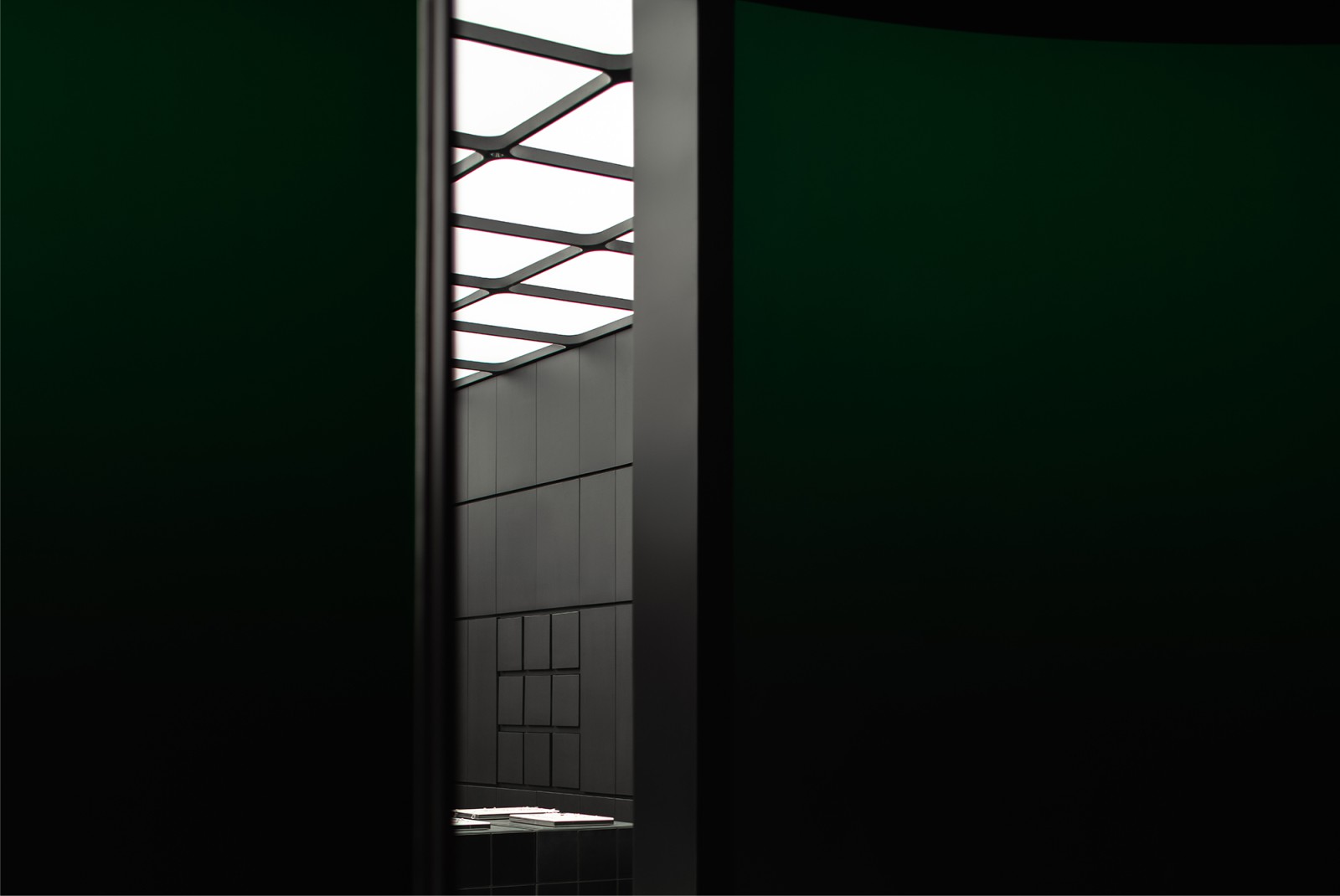
“The meaning of “future” was overflowing. It’s better to explore and visit the scene in person. To rebuild the future,” they say to KILL VIA KINDNESS.
As the core concept of the brand, the reorganized philosophy of art was bound to be dismantled and conveyed through the design language.The whole arc-shaped hot curved glass was at the bottom, and the dark green to black color changed.

A strange device created with the core inspiration symbols, like a spider’s tentacle, stood between the window, blurring the boundary between art and retail. The “spider’s order” was used as a guide and was about to come
Restructure
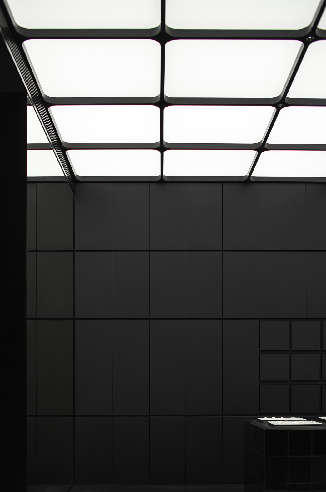
Modern civilization has created countless parts for contemporary mankind, and design also responds here. The concept of “Modularity” is used to realize the penetration of context, so as to complete the change and reconstruction of spatial content.

Several modules are arranged one by one from top to bottom, surrounded by double arcs to realize matrix space construction. The pure black inner wall stands on both sides, with 3×3 free stretching light-emitting modules as a group, providing different booths for the main body of the space. Black and white, extremely simple and clean
New chapter
The central exhibition cabinet is composed of an array of module matrices that can be flexibly moved and spliced, supplemented by different curved booth designs. It matches the product flow and material properties and attracts people’s attention. Source by SIJIA.

- Location: Chengdu, China
- Design: ATMOSPHERE Architects
- Chief Designer: Tommy Yu
- Design Team: April Lo, Chloe Chen, Mao Mao
- Animation Design: Vivi Lee
- Lighting Solution: ArtLuci x Owen
- Wall Craft Solution: souls
- Installation Art: Studio Potpourri
- Area: 180 m2
- Completion Time: October 2021
- Photographs: Chuan He from Here Space, Courtesy of ZZ Media


