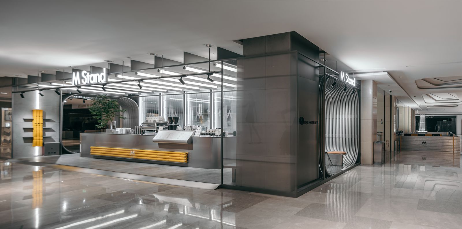
The project, designed by STILL YOUNG, is M Stand’s second cafe opened in Wuhan International Plaza, which is one of the most iconic complexes in the CBD of Wuhan, a commercial center that integrates international trends, avant-garde culture and lifestyle inspiration. Located on the second floor of the mall, the project occupies a total area of about 88 square meters.
The surrounding businesses in the mall are balanced and unified, making it difficult to highlight the identify of M Stand as a coffee brand. As approaching the design, STILL YOUNG’s main consideration was to create a unique sense of place relevant to coffee in the existing space and a relaxing destination for coffee drinking in the busy city.
A unique “field”
With freedom, style and individuality rooted in its DNA, M Stand emphasizes on providing a distinctive “field” for customers. In the dynamic space-time dimension, a “field” with a sense of futuristic mystery emerges from the darkness, which tears, squeezes, splits, mutates and crashes into the city, becoming an indefinable “space station”. As entering this place, customers become the explorers of this “field” and are encouraged to discover the secrets of the “space station” in every detail.
The project responds to M Stand’s aesthetic concept of “creating a distinctive design for each store”. STILL YOUNG combined lighting, a minimalist gray tone and metallic textures in the design, and preserved the original features of the building. At the same time, the design team attempted to break the silence and highlight the uniqueness of the space by extending the sight line from the inside to the outside.
Freedom and fluidity
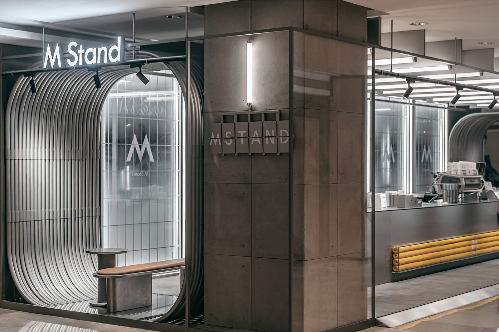
The shopping mall in which this space station-themed M Stand cafe is located has various functional divisions. The second floor of the mall provides a luxurious shopping experience, and the light sources are mainly in warm tones. To distinguish M Stand from the surrounding businesses in the mall, STILL YOUNG envisioned it as a “space station” by adopting a minimalist grey tone and cool light sources.
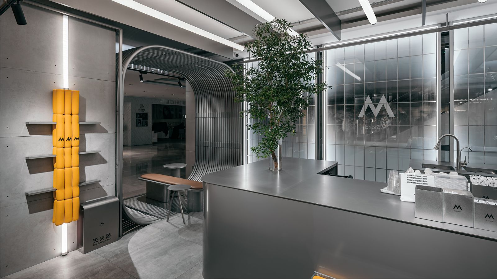
The cool white strip lights and matte metallic gray lines are like a space-time boundary, allowing customers to travel between reality and the future. The design creates an inclusive, outward-facing form, and a fluid space centering around the metal bar counter. The translucent backdrop wall stimulates the imagination and desire of passers-by to explore the “space station”.
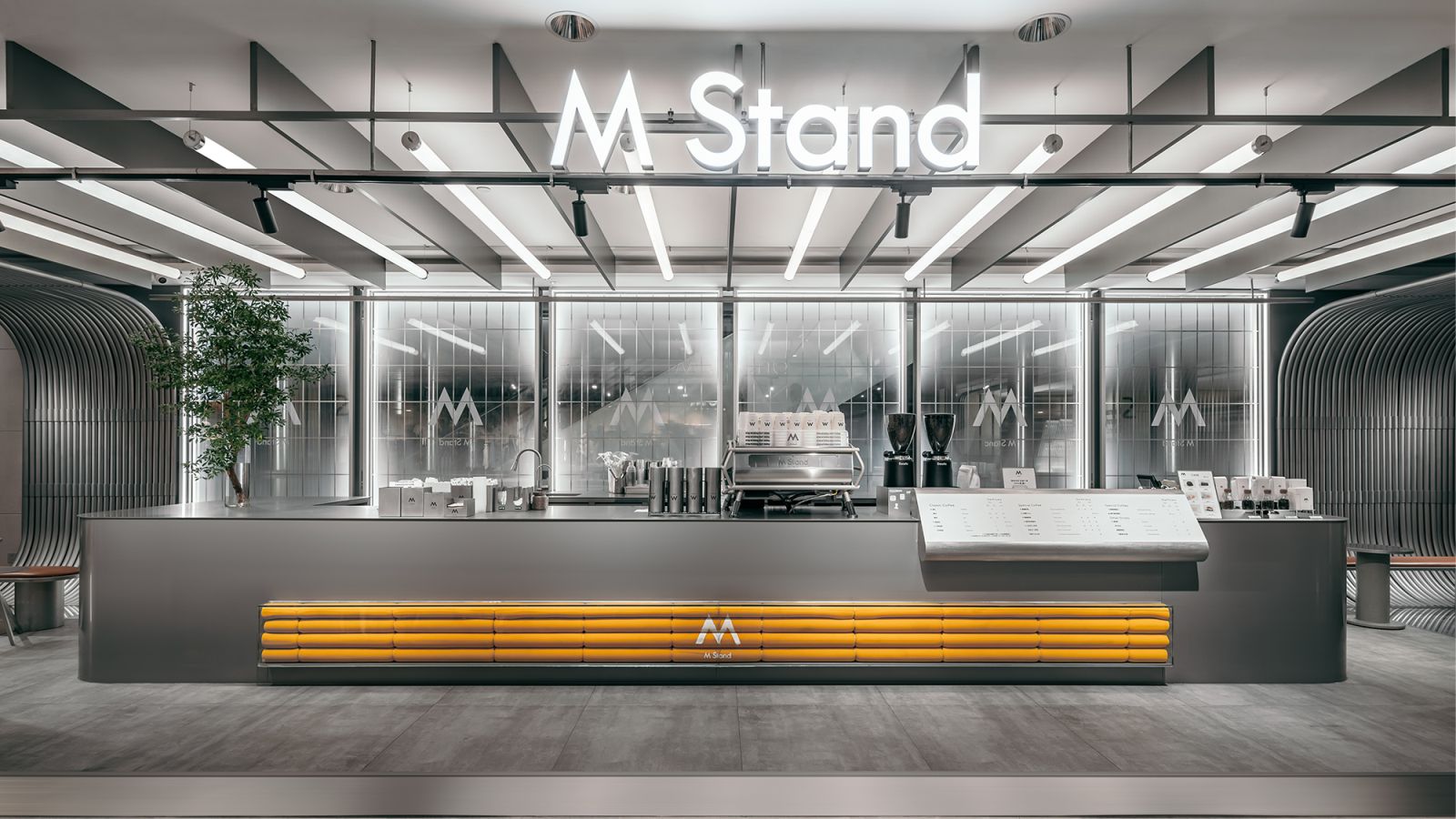
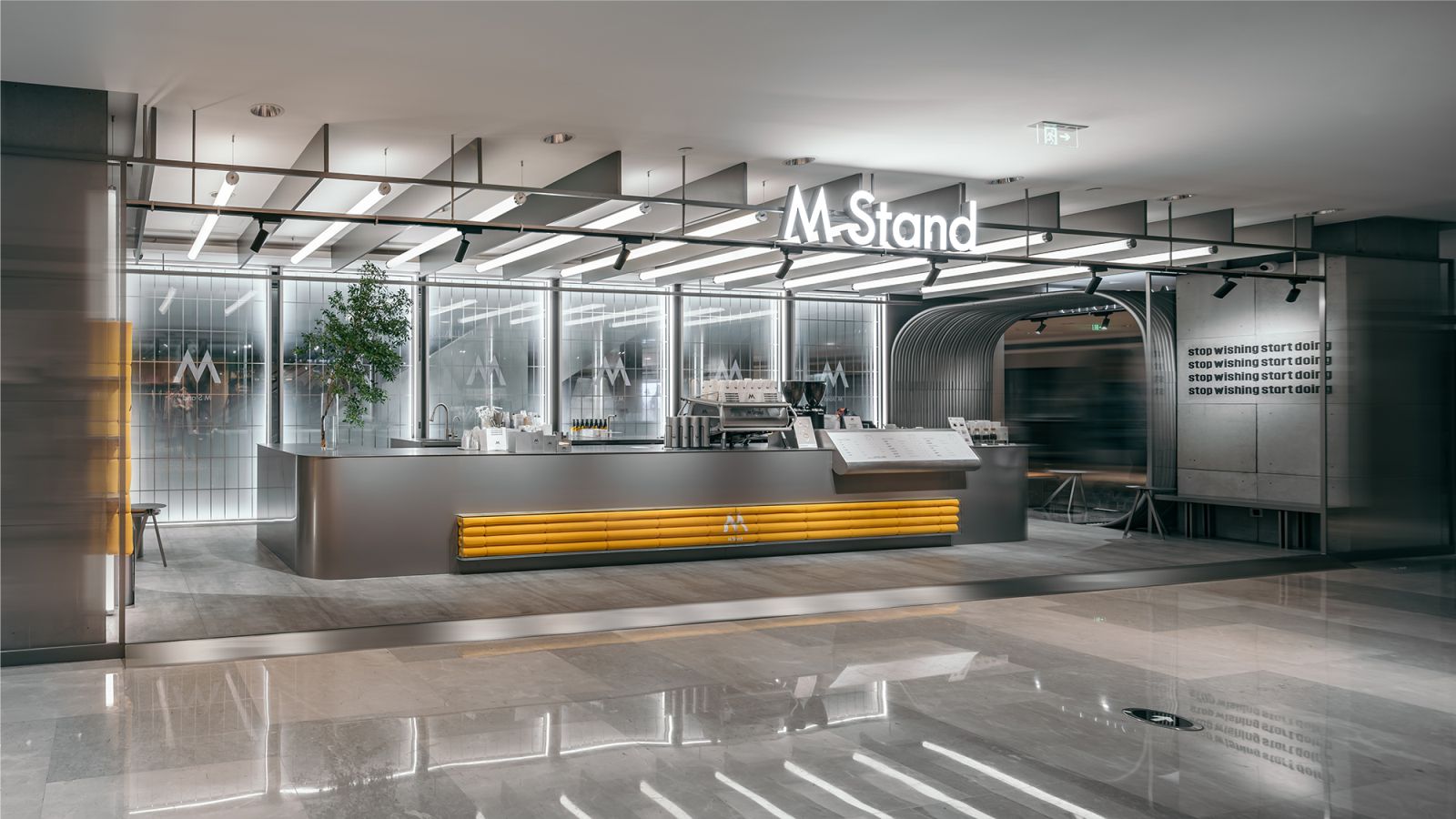
The designers expanded the depth of view as much as possible within the limited spatial scale, to create an experience of freely traveling through another space-time dimension. The existing columns on either sides of the space and the original ceiling couldn’t be demolished.
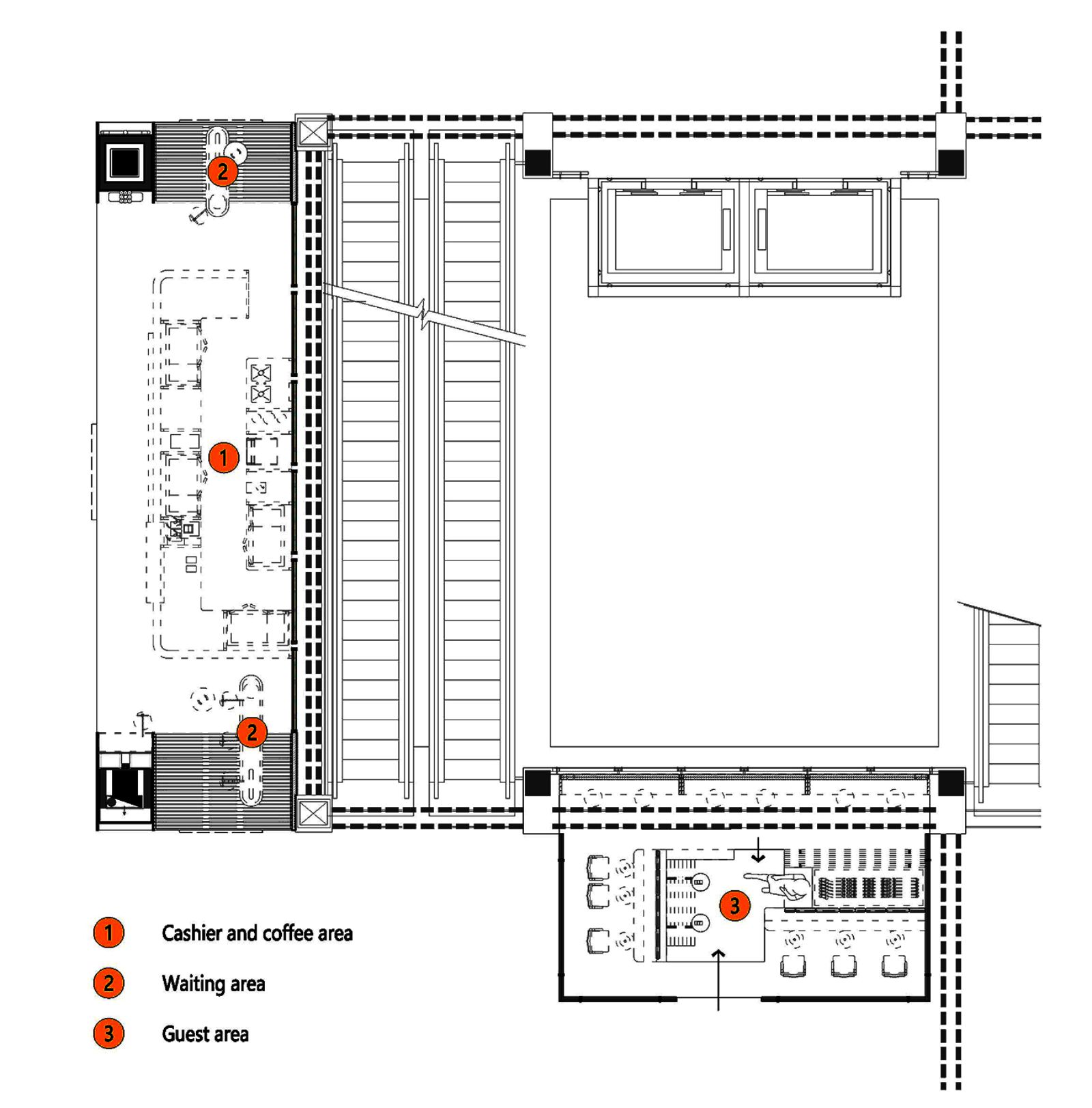
The design team made use of the original building structures with a unique design approach, and re-organized the space in an orderly manner within a limited area. The space is divided into a bar counter, a passage and seating areas. The design not only connects different functions, but also ensures integrity and consistency of the overall space.
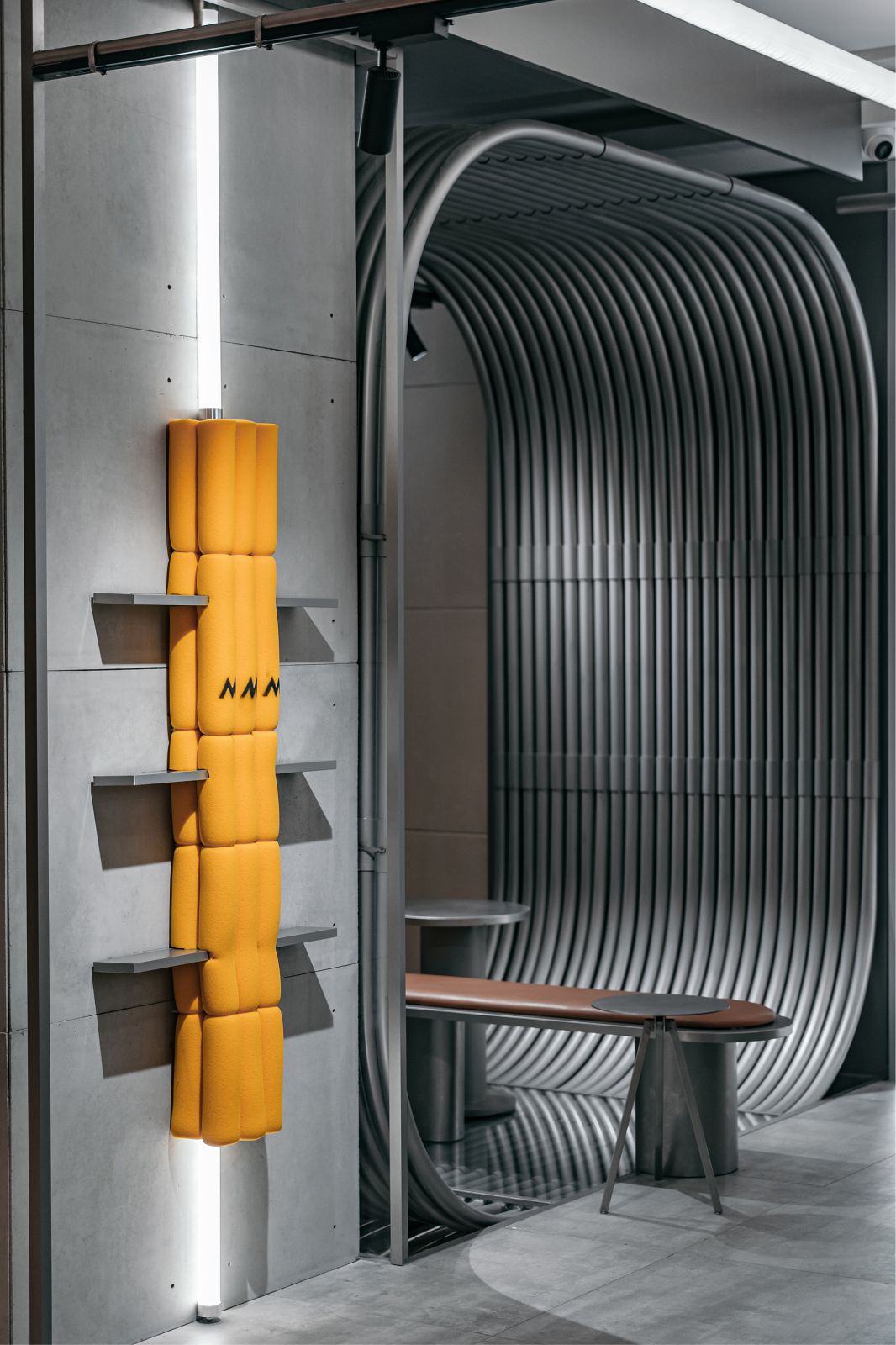
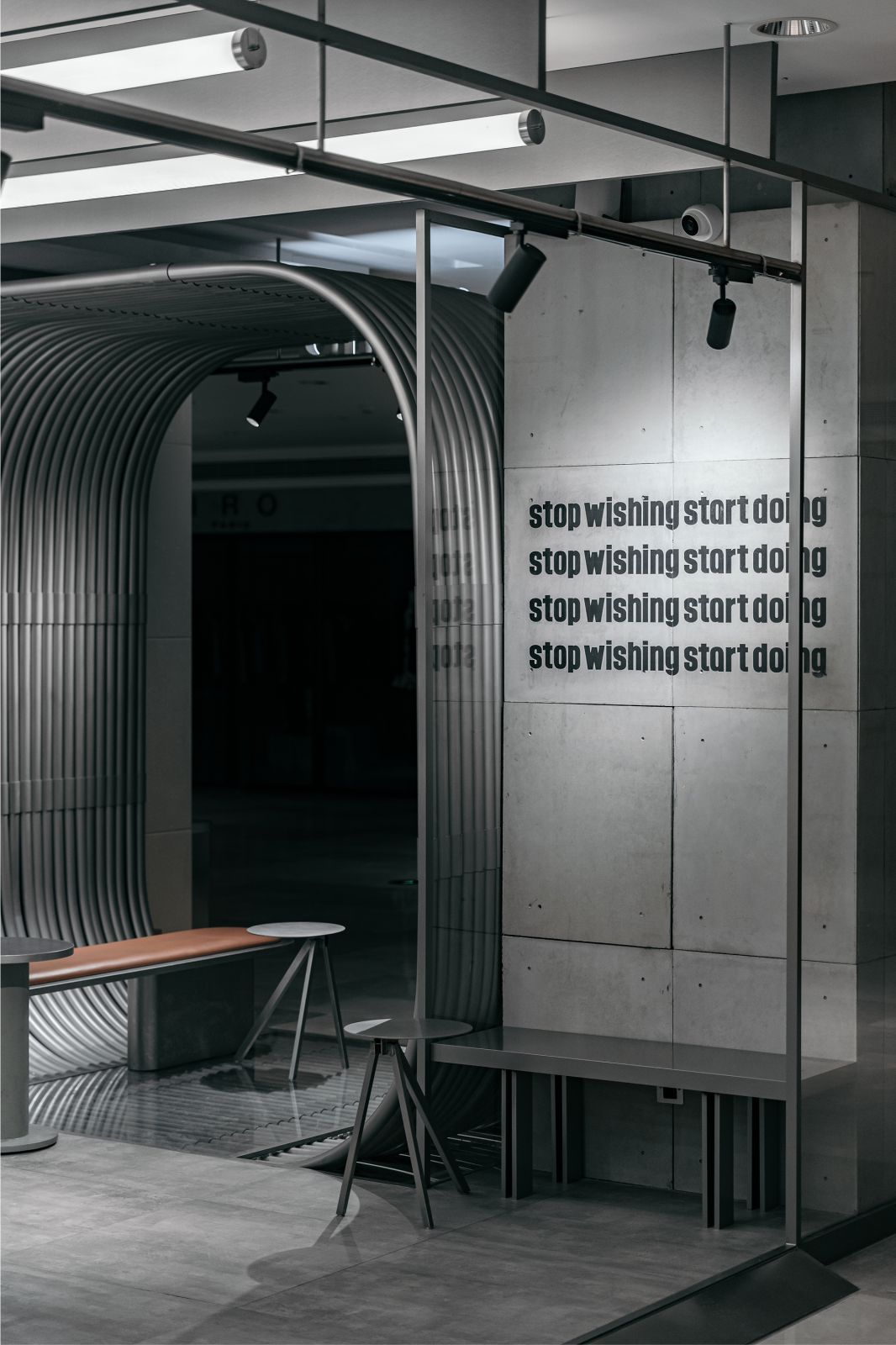
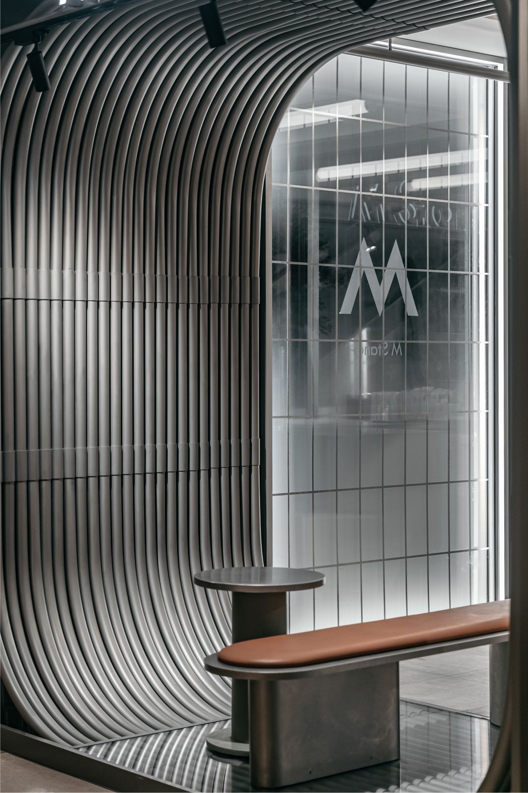
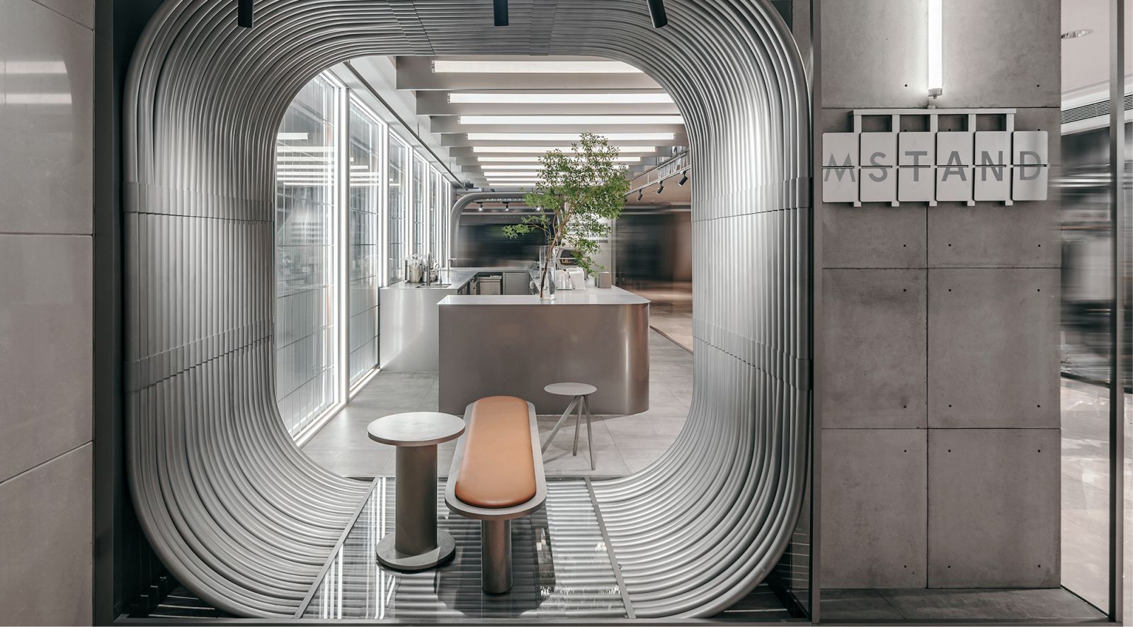
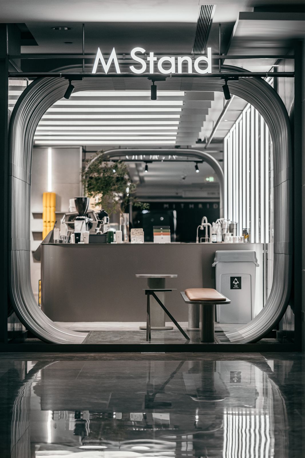
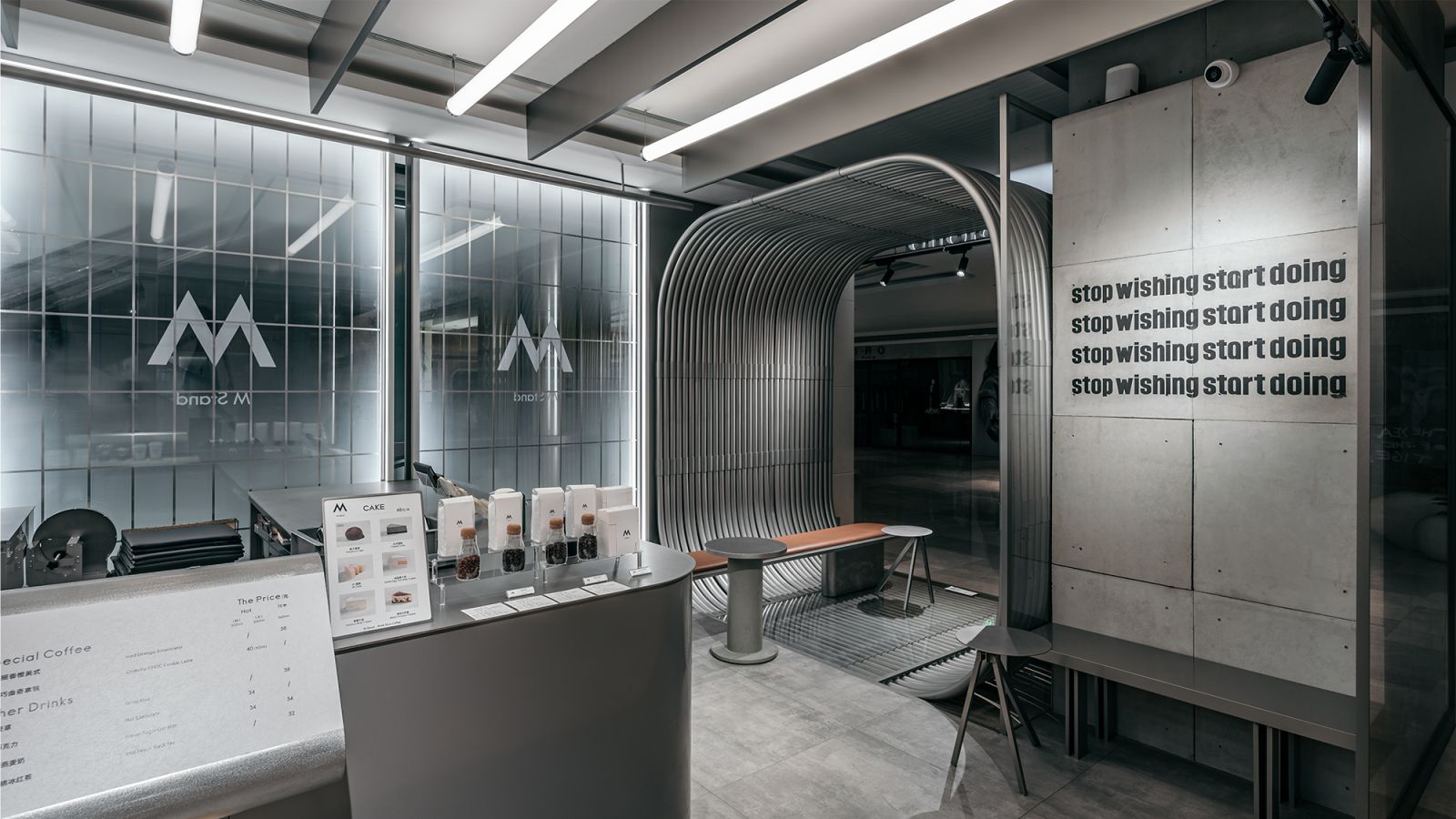
The seating areas behind the columns are shaped by curvy stainless steel lines. The fluid lines and the unique circular form highlights a distinct social attribute and a sense of imagination, and meanwhile echoes with the brand’s DNA through a spatial expression that features sense of freedom and infinite tension.
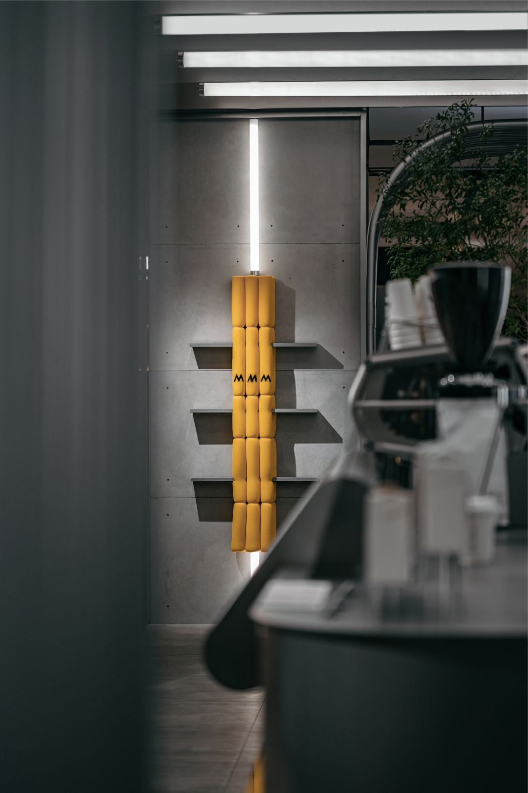
To simulate the sponge-wrapped machinery of space station, sponge elements are scattered on interior surfaces. The warm orange hue of the sponge, together with the greenery on the bar counter, absorbs the coldness of the gray tone. The inherent coolness of stainless steel and concrete is softened in the balance, which adds a sense of affinity to the space.
Distinctive character
As customers leaving the bar counter and passing through the stainless-steel seating area and the mysterious corridor, a floating island will come into sight. The M-shaped acrylic installation is unique and striking, juxtaposing two seemingly parallel but separate places in the same dimension. Like a mysterious sign, it attracts explorers into another world.
Like a luminescent body, M Stand’s logo is a cue, emitting a flood of white light that speaks for the brand’s unique personality. Various details, such as the iconic storefront, the transparent glass finish, the orange sponge elements, the steel partitions in the seating area, the brand’s catchphrase “Stop wishing start doing” on the concrete column, and the contemporary minimalist lines running through the top of the space, all manifest the brand’s distinct character. Source by STILL YOUNG.
- Location: Wuhan, China
- Architect: STILL YOUNG
- Design directors: Eric. Ch, Yanagi
- Branding art consulting: Eva Liang
- Construction drawings: Jeff Wang
- Renderings: Kohler Zhang, Mr. Xu
- Project area: 55.3 sqm+ 33.1 sqm
- Completion time: 2022
- Photographs: ZD studio, Courtesy of STILL YOUNG
