“It is the best time in our Museum”s history to transform our building to articulate the dynamic and diverse programming we provide. A transformation to the DMA campus will send a signal that we are inviting everyone near and far to join our vibrant art community.” “We need a building that reflects our importance to the city and has the potential to introduce new ways to present and interact with art.”
Architect Selection Committee Co-Chairs, Jennifer Eagle and Lucilo Peña, said: “The new and reinvented DMA promises to be a confident exemplar of sustainability and urbanism but also to be a place that”s just fun to be in.
“Nieto Sobejano Arquitectos is known in international design circles but is possibly a new name for the American public. Significantly, this will be the firm”s first building in the U.S.
“The Committee found the winning team a delight to interact with during the competition workshops and visits – they listened carefully, questioned us, and continually reappraised their approach.
“We are immensely grateful to the five runner-up design teams who performed at the highest level and produced such committed work. It was a rare privilege to get to know them during the competition process and we want to express our profound admiration for their work and the creativity they brought to the competition process.”
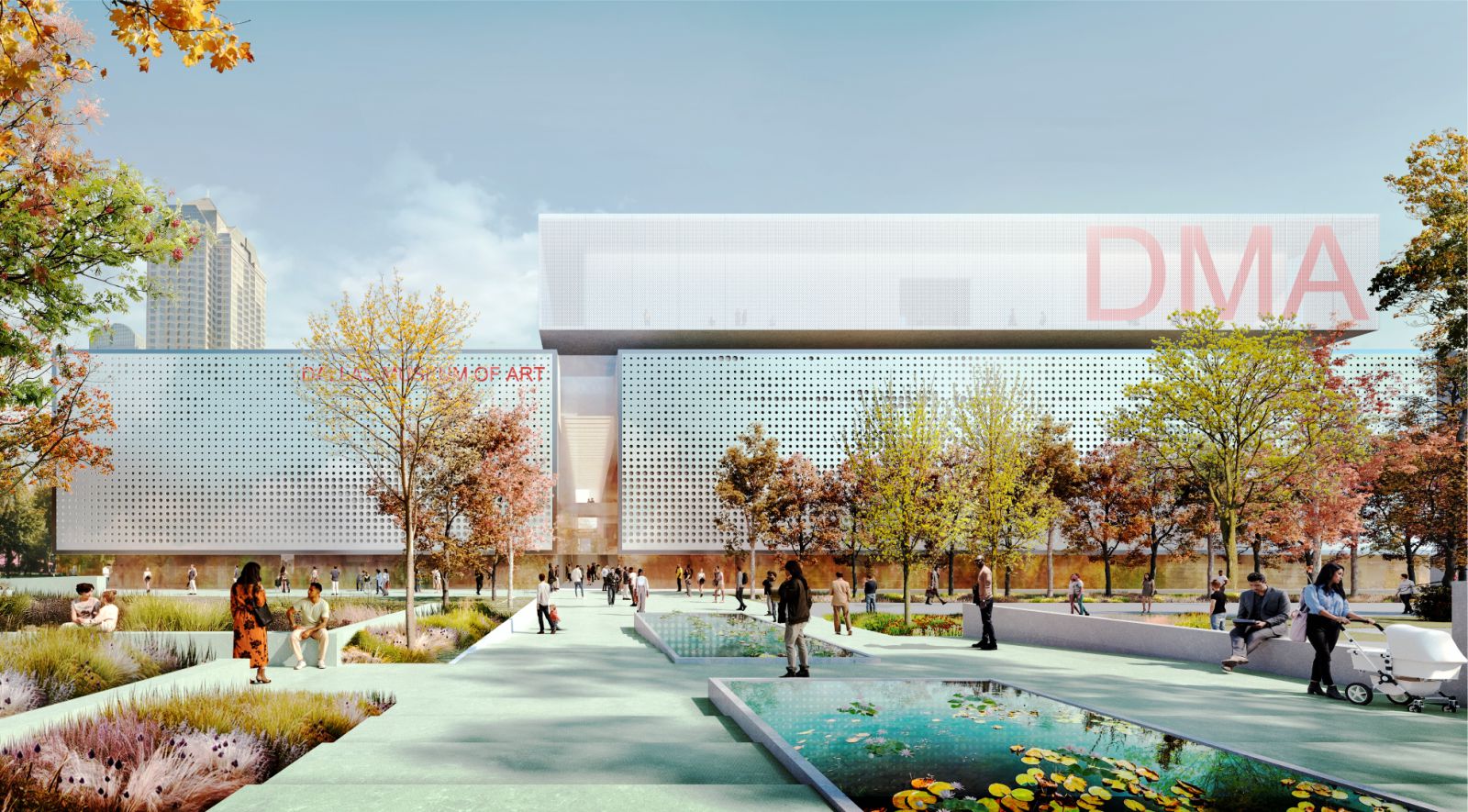
The winning concept design was embraced by the ASC because it provides potential solutions to address circulation, sustainability and gallery expansion while respecting the existing building. The committee was also attracted to the balance created by the
proposed north and south façades.
NSA’s design moves include enhancing the interior street by bringing light in from above, improving accessibility by rationalizing the stepped ground floor ramp and gallery half levels, and making visual connections through the entire building north and south.
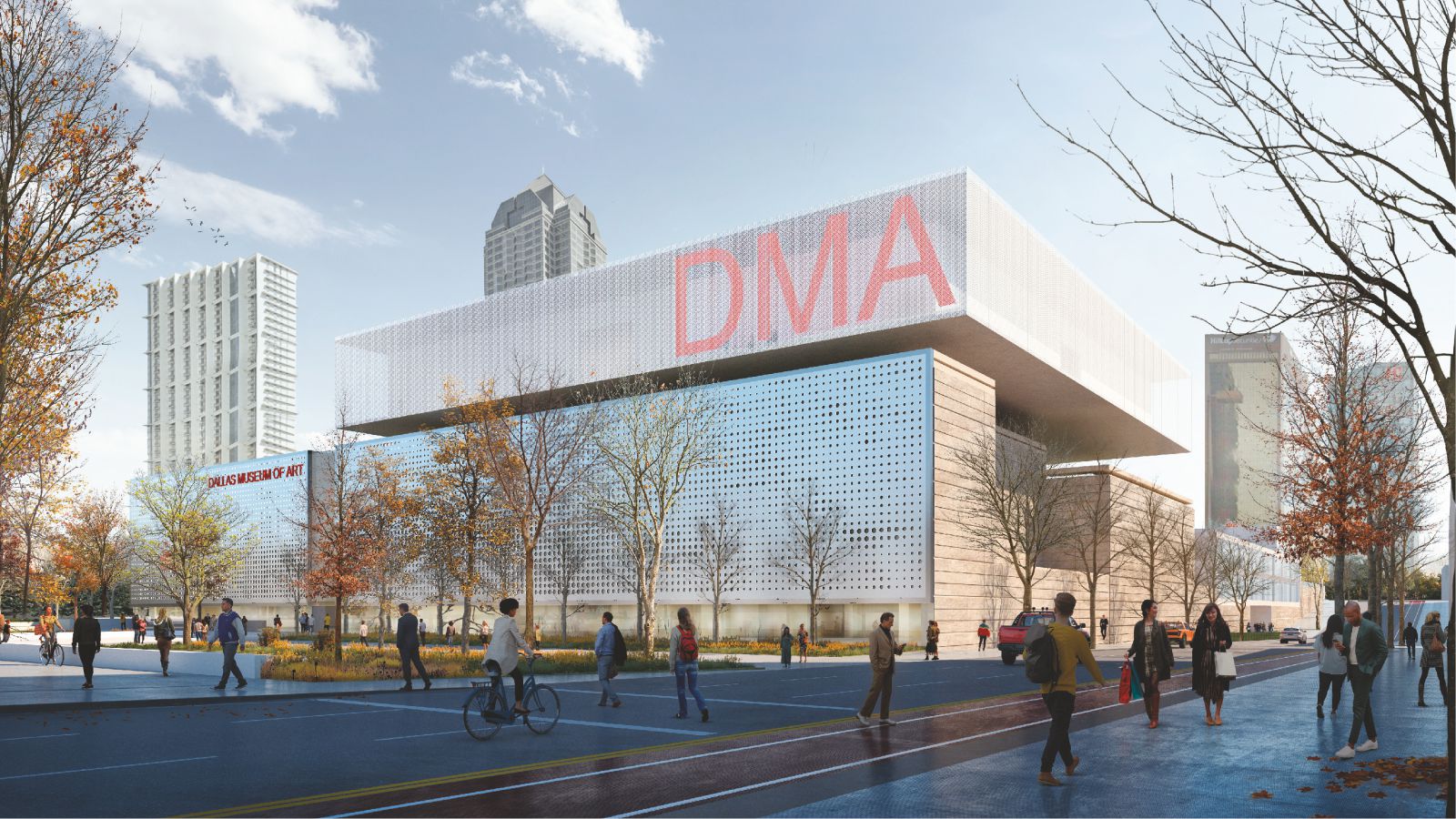
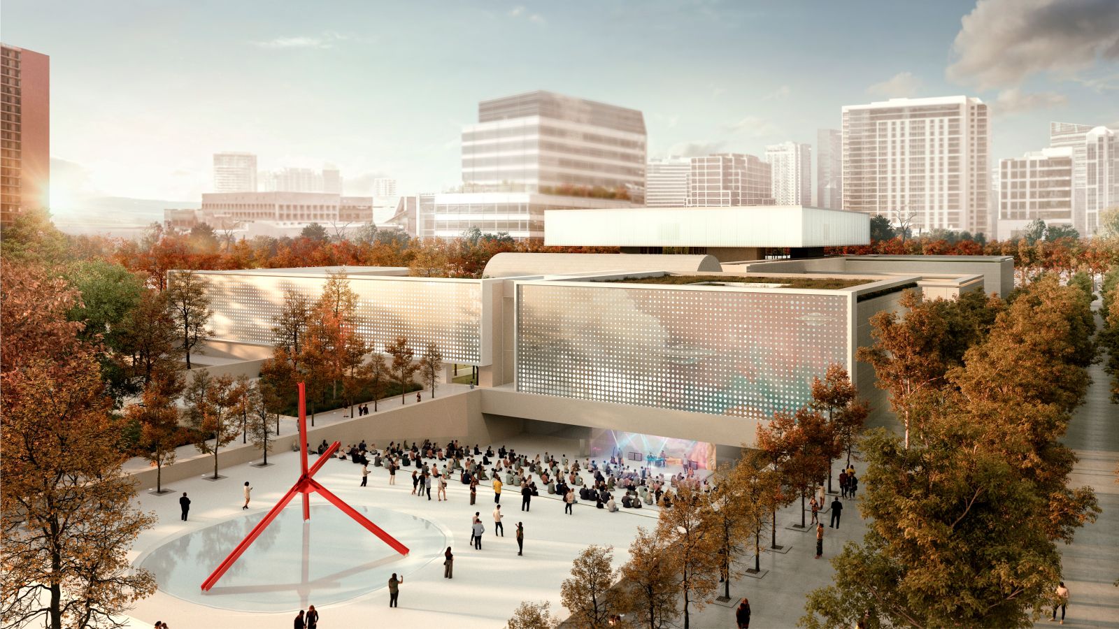
The design unifies the vertical circulation and references the interior street so visitors can easily orient themselves. Two new dynamic façades reinstate visibility and identity equally from the south at Ross Plaza (currently underplayed) and the north end at Woodall Rodgers.
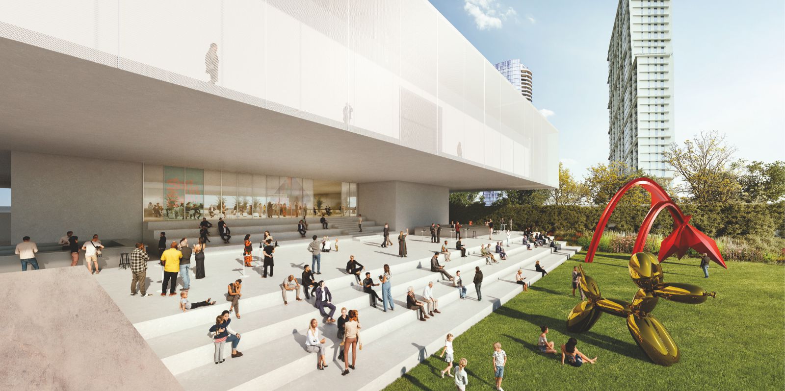
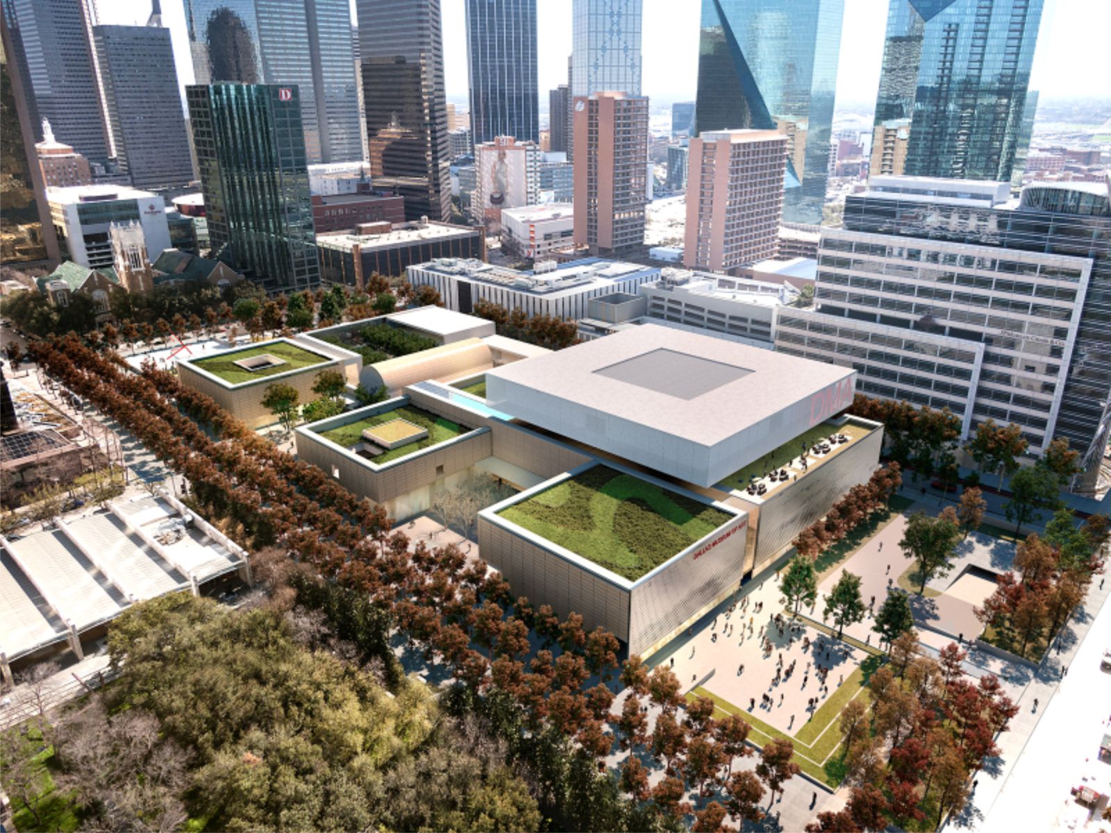
The concept addresses the need for expanded gallery space by creating a dramatic floating square extension on the roof – reflecting Barnes’ square grid – a huge flexible space for displaying contemporary art. The extension also incorporates an events space and restaurant, with a roof terrace overlooking Klyde Warren Park.
Education and performance spaces are arranged along Harwood Street, with streetlevel glazing encouraging curiosity and opportunities for activation of the Flora and Fleischner courtyards. A new covered loading dock with facilities for conservation and staff offices infill the
underused area off North St Paul Street.
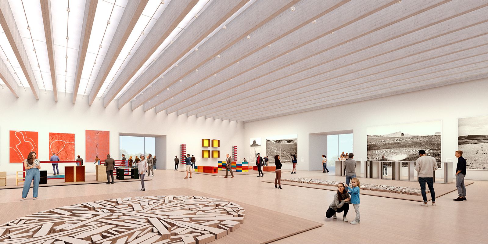
The principles of sustainability are addressed impactfully with the decision to retain much of the original building’s embodied carbon by limiting changes to the existing structure and fabric, further enhanced by an integrated approach to rainfall collection, bioclimatic design, and electricity generation through photovoltaics and geothermal energy.
The team set out to make their design ‘precise and beautiful’ reflecting the spatial hierarchy and grid arrangement developed by Barnes, embracing nature, and opening up the ground level to achieve transparency and engage with the street. They propose activating the Ross Avenue entrance with an informal outdoor amphitheater and moving the sculpture garden barrier wall to improve access into the garden. Source by DMA and images Courtesy of Nieto Sobejano Arquitectos.

