


The owners brief was to design a dramatic, memorable house. The house needed to suit his specific aesthetic considerations and have the flexibility that it could be either partially or completely rented out. The client has a discerning eye for striking contemporary design and that, along with the fantastic position of the site lent, to creating an elegant response,” says Philip Olmesdahl, Project Partner.

A double storey house was positioned centrally on the site i.e. where it starts to widen towards the north which basically cut the property in half resulting in a very large south facing front garden. As the existing house did not maximize the sites’ potential, it was entirely demolished except for the small basement area which was converted into a guest suite with special views of its own. The challenge with the site was its shape; it is 50m long and only 20m wide (at its widest).

Our response was quite striking due to its strong lines, yet created difficulties in how to accommodate all the rooms without creating a dull layout. The property not only had an existing building which needed to be demolished but it also had extensive fill above the natural ground level. The property, and subsequently the plan of the house, focused on Camps Bay beach, and the views of Lion’s Head in a Northerly direction. There are also great views back to The Twelve Apostles and the Cable Station. “To capitalize on the views, meant that the design also needed to respond to issues of privacy with the neighbour’s property.
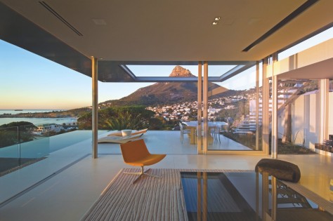
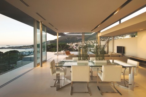
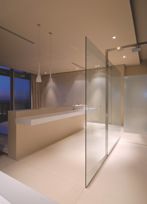
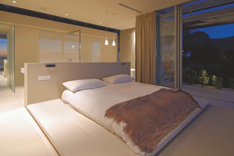
Clerestory frameless glazing (skylights) replaced structure and framed views which might otherwise have been missed. Sandblasting of the full height glazing at the eastern boundary enabled us to maximize light to the linear passage and maintain views of the mountain peaks whilst adhering to councils requirements and ensuring privacy of the neighbouring property,” says partner Stefan Antoni. The bedrooms were simply arranged to look west towards the great sea views – off the linear circulation space which forms the rear ‘spine’ of the house.

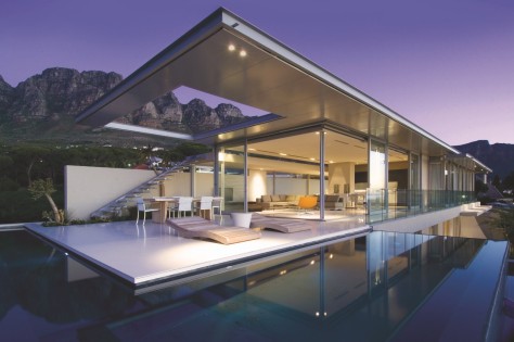
There is a dramatic staircase in this circulation space; with good views back to the Cable Station.The living spaces are at the Northern side of the house, and feel like they propel themselves towards the view. All living spaces have a great connection to the covered or uncovered terraces and the interior / exterior space continuation is dramatic. The living spaces are highly transparent to take full advantage of views. The Upstairs & Downstairs are very similar in that each level is fully equipped and independently habitable.
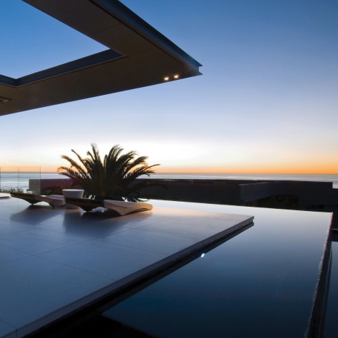
The ground floor differs in that it has a self-contained staff suite, only two bedrooms and a water feature which runs the full length of the passage emphasizing the linearity of the house. At this level the views from the terrace are mostly restricted to the North. However, at the First Floor one is elevated above the neighbouring houses and can appreciate the 360 degree view. The roof over the deck has a steel structure which cantilevers out of the reinforced concrete of the roof slab. A steel ‘ring’ beam was used to create the cut-out and the remaining external extent of the roof was then clad with aluminium panels.


Steel sections remain visible creating the illusion of a very thin roof. Reinforced concrete upstand beams are however set back from the edge of the roof edge and are not visible from below. Materials were selected to create a calm and contemplative feeling. The pale colours reflect light in all spaces complementing the casual feel of the house. Also, some bedrooms are quite compact and the lighter colours tend to increase the sense of spaciousness. All finishes were selected to be robust, easy to maintain and easy to live with. Polished porcelain tiles were used throughout – large, light and seamless, ensuring uniformity between spaces.

‘Duco’ to joinery – single tone and understated, with stylish square door ‘knobs’ in bedrooms. ‘Poggenphol’ kitchens. ‘Balau’ timber deck weathers well to an elegant silvery grey tone. ‘Walnut’ cladding to the cantilever treads rich contrasting colour.The interior with its minimalist style brings warmth through texture, in fabrics and surface finishes. The colour palette is neutral (soft greys and charcoals) however we have brought colour into the spaces, through accent pieces,” says Mark Rielly of Antoni Associates. The design is primarily in response to site and aspect; and creates a dramatic space for enjoyable living – that is always in fashion. Source by SAOTA.
Location: Cape Town, South Africa
Architects: SAOTA
Project Team: Stefan Antoni, Philip Olmesdahl, Tamaryn Fourie
Interior Design: ANTONI ASSOCIATES
Project Team: Mark Rielly
Main Furniture Supplier: OKHA Interiors
Area: 676 m2
Year: 2007
Photographs: Wieland Gleich & Karl Beath, Courtesy of SAOTA