The Pratic Spa, a manufacturer of solar shading systems, is an industrial site where the architecture for production becomes a contribution to the landscape and reinforces its identity. The intervention involves and integrates industrial volumes and vast open spaces. The productive and directional functions relate to the landscape without mimicry, and the spaces are designed with the aim of establishing a constant dialogue between inside and outside. The building thus becomes a comfortable and functional landmark.
The typological plant includes an office building, a showroom, research and innovation laboratories, spaces for production, painting and warehouses, a wellness area for employees. All these functions are linked by the design of open spaces and parking lots, defined by the embankments modeled along the roads, by the spaces dedicated to relaxation and meeting, by the control of the views on the landscape. It is an industrial building in constant relation with the natural landscape. The headquarters were built in two phases: the first in 2011 and the subsequent expansion in 2018.
PRATIC 2 . Production complex enlargement (2018)
The enlargement of the Pratic, built in adherence to the industrial building of the first lot, is a complex project, despite apparently showing an essential character. This is a rectangular building of about 9.000 sqm that completes and improves the existing production department built in 2011. The functional program is almost the same of the previous building: offices, services, canteen, wellness area, production, warehouses, painting plant, as well as parking areas and service areas included in the rigorous design of the open spaces.
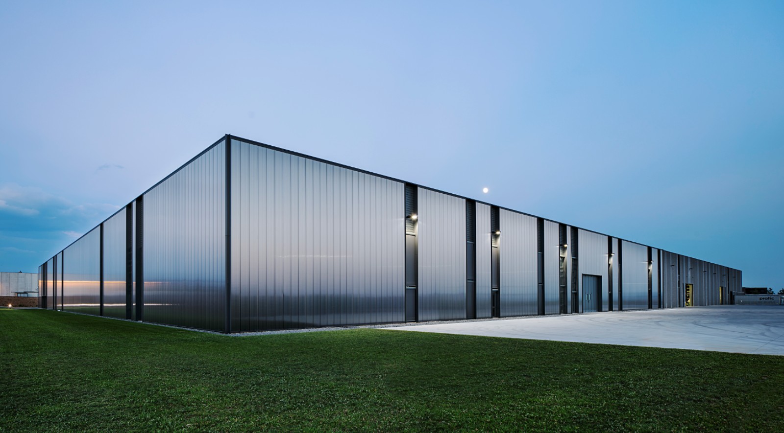
The new building consists of two simple elements: the rhythm given by the windows, which repeats and declares continuity with the existing facade, and the reflecting skin, which dissolves the new volume in the sky. The first lot, black and grainy, seems to arise from the ground, settling the building in place; the second lot, always black but reflective and iridescent, mirrors the landscape and the light with images that are always different due to weather variability. The first one is “heavy” and permanent, in search of eternity, the second one is “light” and changeable, ready to dissolve in the sky: the building completed the molt of its skin.
The facade consists of a single material, of a unique size: a polycarbonate panel fixed to prefabricated concrete structure. The panels consist of two different types of polycarbonate combined together: the rear side has an opaque compound which impedes the light to pass through, while the front is “frozen”. In this way the load-bearing structure is completely hidden behind the cladding system and the verticality of the new facade sets up an interesting dialogue with the black concrete panels of the existent building. The building reflects the sky and appears cladded by huge glass plates, while close up it looks “lighter”, maintaining a dialogue with the pre-existence.
The entire settlement is included in the architectural design of the landscape and open spaces. Places designed for relaxation, pedestrian paths and parking lots are enclosed in the design of the “modified embankments” that insert subtle variations of slope with respect to the roads and access roads. In this way, the project is inserted in the ground in a clear way, highlighting the shape and geometry of the territory. The building demonstrates that industrial architecture can add value to the landscape and improve the quality of the workplace. This is a great opportunity to rethink the relationship between architecture and nature, putting man back in the middle.
PRATIC 1 . Offices and production complex (2011)
The complex placed adjacent to the provincial highway that leads from Udine to Spilimbergo. The intervention is composed principally by a parallelepiped volume with a surface of approximately 9.000 sqm that houses the main productive core and a second volume of about 1.000 sqm placed adjacent to the first but rotated in order to align with the highway is dedicated to the offices. The area, anchored in the industrial zone of the town, is also intimately tied to the surrounding agricultural landscape and is framed at north by the mountainscape.
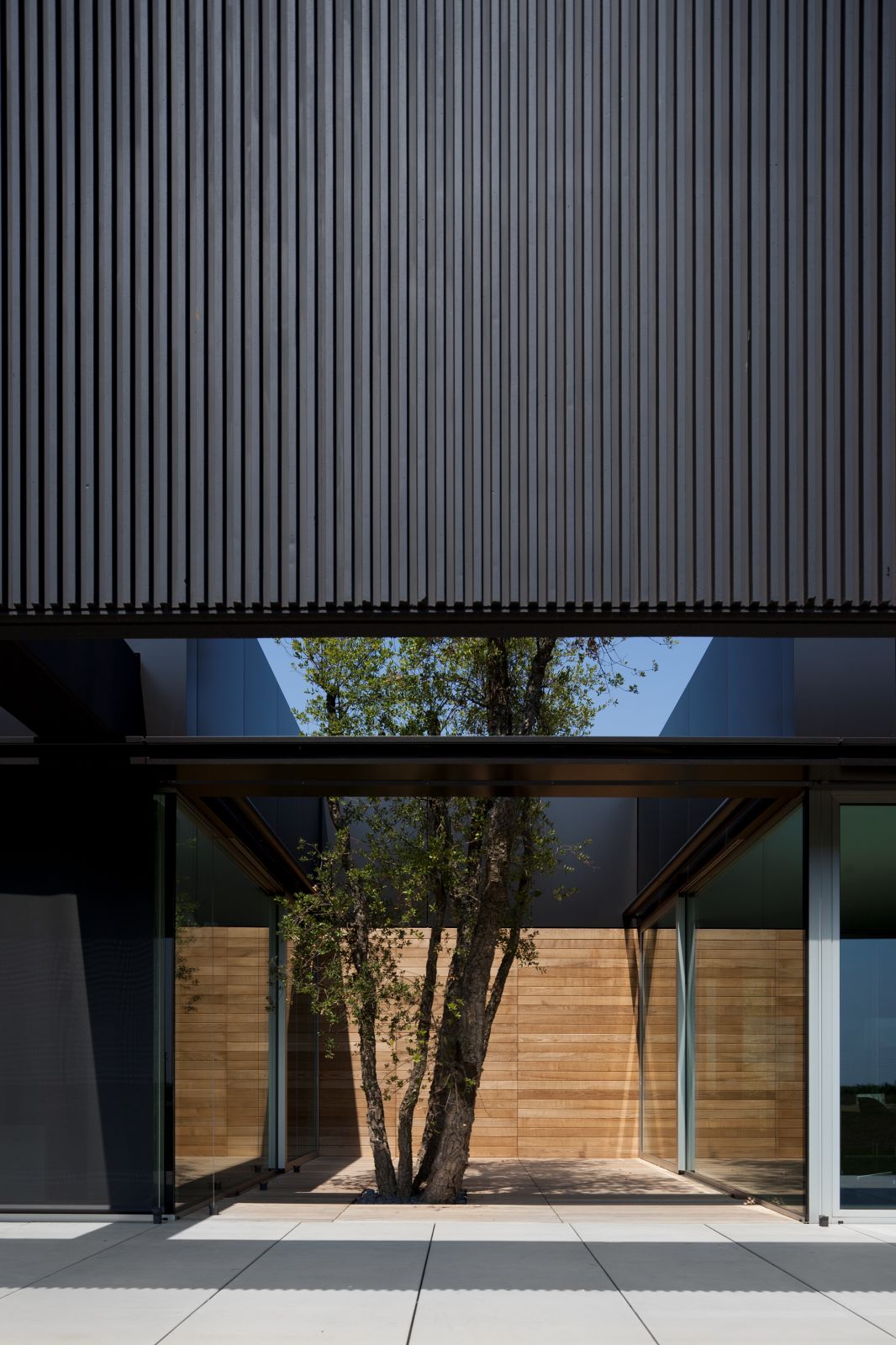
The project is infused with a strong desire for simplicity. The volume housing the offices becomes a striking sign even to those driving by on the highway, one that seeks to establish a dialogue between the concepts of stasis and movement. The production core’s more pronounced verticality is characterized by a striated facade dominated by alternating glazed surfaces and solid panels of diverse widths that are always ten meters in height. The differing dimensions of black marble stone and dark cement that make up the finish of the panels allow for a varied facade alive with the interplay of sunlight, shadow and changing atmospheric conditions.
The office core is protected on the south side by a dark concrete beam of grand dimensions (approximately 80 meters in length) that highlights at a larger scale the horizontality of certain elements of the project. The beam, parallel to the ground, projects beyond the building’s perimeter as if to indicate a confrontation between itself and the landscape. Its reflection on the glazed facade yields a great “floating shade” that serves a climatic function by mediating temperature within the work spaces.
This simplicity can even be understood in terms of the project’s interaction with the surrounding context: the cultivated terrain opens towards the southern and western fronts of the complex, merging it with the landscape. The two main buildings straddle the garden, a semi-private area that reconciles the production core with that of the administration. The materiality and nature of the space interrupts the fluidity of the office core, thus creating a more intimate relationship between nature and man. The area reserved for vehicles is situated within a circular perimeter slightly buried in respect to the highway in order to buffer the visual impact this has on the project. Source by GEZA.
- Location: Fagagna, Udine, Italy
- Architect: GEZA (Gri e Zucchi Architetti Associati)
- Architect in charge: Stefania Anzil, Fabio Passon
- Structural design: A. Nutta, Nuttassociati
- Mechanical plants design: Studio Bulfon Associati
- Electrical plants design: Studio Battista
- Contractors: Spav Prefabbricati Spa (prefabricated structure)
- Building contractor: Edildri Costruzioni Srl
- Landscape: Slurry Italia Srl
- Mechanical plants: Vaportermica Commerciale Srl
- Electrical plants: Elettrica Ducale Snc
- Photovoltaic plants: Sataenergy Spa
- Client: Pratic F.lli Orioli Spa
- Dimensional data: 33.000 sqm
- Production: 10.000 sqm
- Offices and services: 1.000 sqm
- Showroom: 550 sqm
- Loading area: 2.700 sqm
- Landscape: 33.000 sqm
- Parking lot: 120 places
- Year: 2018
- Photographs: Javier Callejas, Fernando Guerra FG+SG, Courtesy of GEZA


