

Starting Point
Fc Internazionale Milano approached us to discuss the evolution of their brand identity. Football clubs are now more active beyond the pitch and the world of football itself and with this new activity it is important to adapt and establish a competitive identity. For every football club the crest is the holy grailadored by millions of fans around the world. So working on the crest was the starting point but also the most challenging part of the process.
Inter as a Club with a Rich History Versus Inter as a International Brand
The duality of internazionale and Milano was essential for the redesign. The club is proud of its milano roots and of its international fan culture. This pride is exemplified and amplified in the new crest. Internazionale „I“ and milano „M“ are more prominent than ever before.

What about the Biscione
The biscione is the heraldic and historical symbol for the city of milano and is inseparably connected to the club of Inter. The biscione even became the official logo for a short time in the late 70s. It is still part of the redesignused as biscione skin patterns, illustrations of different drawing styles, 3d renderings and physical merchandise.
Blue, Black, and Gold. Thoughts about the colors
The colors of the club were defined by Giorgio Muggiani in 1908, when he drew the original crest on the night of march 9th. Each color has a separate and specific significance. Ever since the club was founded the Inter team has almost always worn black and blue stripes, earning them the nickname nerazzurri. For the last 110 years the Inter colors have only changed in gradation. We did the same. The blue is now more intense compared to the old azure. The new saturation brings a modern and digital touch. The same applies to the gold. It appears now as a vibrant and powerful color – similar to the gold used in the iconic 90s jerseys.

Image © Bureau Borsche

Football Clubs and their Challenge Nowadays
For Inter, and for european football in general, now is the time to introduce a new direction. It is time to face the challenges of our increasingly demanding world, both on and off the pitch and across the globe. For a football club to move beyond the stadium gates and weekly games, it needs to present itself as a global brand.
To not only be present in society and in the world of sport but to emerge in the broader sphere of consumption (of goods and content), communication, and become a fully-fledged entertainment company. 100 years ago football clubs were able to communicate for only 90+ minutes on the pitch… now its 24/7 on social media. The consumption of content and the accompanying brand identity requirements have changed.
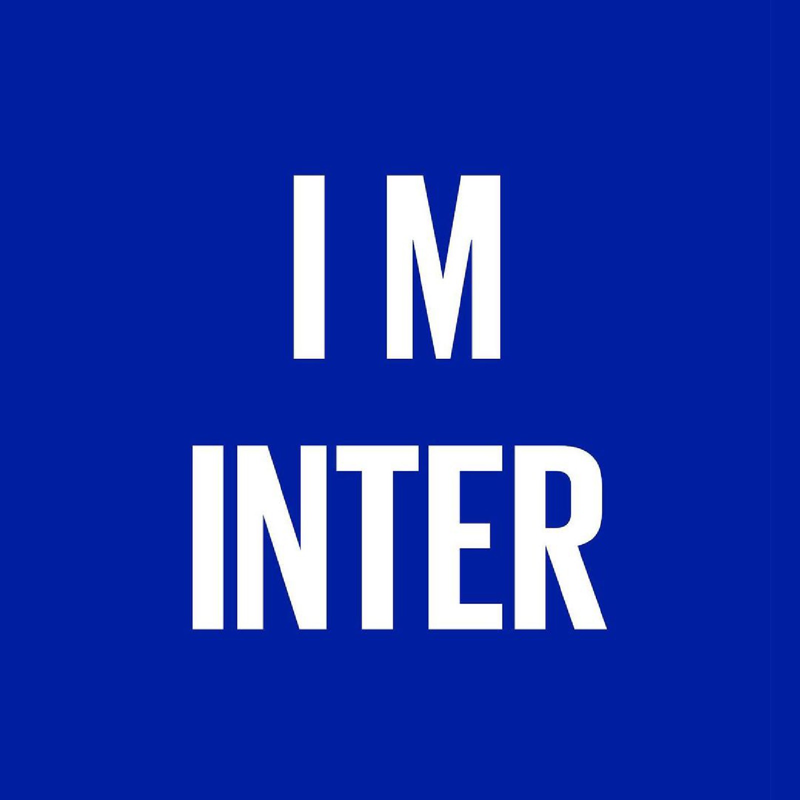
Image © Bureau Borsche 
Image © Bureau Borsche
Inter’s old crest compared to the new one
The lettering and character composition of the old crest was beautiful. At the same time it was quite complex. The new crest focalizes on the i and the m. the „I“ remains at the center of the crest. Though slightly modified the „M“ retains it’s unique overhanging arms. the symmetrical „M“ remains behind the „I“. The circular foundation of the rings also remain intact. Over all the visual appearance of the new crest hints at the old one. The relation of space between letters and the whitespace in between remains almost the same (around 90%).
Excitement of re-designing a football clubs holy crest
working for a football club with such strong history and enthusiastic fans is something special and super challenging! most people are not big fans of change, especially when it comes to something their heart beats for. We approached the job with great dedication and understanding. Source and images Courtesy of Bureau Borsche.
Image © Bureau Borsche 
Image © Bureau Borsche 
Image © Bureau Borsche Image © Bureau Borsche Image © Bureau Borsche 
Image © Bureau Borsche